Scope
Industry
Non-profit
What we did
Brand Strategy, Visual Identity, Verbal Identity, Brand Activation, Employee Engagement
Collaborators
Dalton Maag
Awards
Winner for Best Brand Development, Third Sector Charity Awards 2019
Challenge
One in five people in England and Wales have disabilities, which often aren’t visible. The truth is life’s harder when you’re disabled.
Scope’s new strategy works towards the UK being a country in which disabled people and their families enjoy equality and fairness. And a new, accessible brand was needed to deliver this game-changing ambition and build a better understanding of what the charity stood for.
Strategy
We wanted to prove that inclusive design could still have a distinctive personality, so we kick-started the design process with a workshop where people with different visual impairments would stress test existing accessibility standards and help to inform new ones. A refreshed set of standards went on to inform the visual identity.
Brand system
The brand concept ‘Disability Gamechangers’ elevates the brand into a challenger space and champions inclusive design at every opportunity.
Collaboration was central to the creation of the visual identity. During a two-week design sprint, we worked with Scope’s internal design team and various industry specialists to establish a clear set of design principles.
The brand elements were then stress-tested across key channels – from advice and support, to policy and campaigns, and fundraising.
We also supported Scope in developing and embedding their employer brand. Key activation tools included a brand spirit guide and film, and a managers’ toolkit.
The new logo clearly indicates Scope’s purpose through the equality symbol and strapline. Together, they embody the ambition to inspire a movement to end disability inequality and achieve everyday equality.
The new corporate font, Hargreaves, is specially designed to maximise legibility and readability. It has multiple accessibility design features such as a larger x-height, generous spacing between each letter and no ambiguity between letters and numerals.
Scope and the disability sector have strong associations with the colour purple. Purple remains the brand’s primary colour, but in a brighter shade, and is accompanied by yellow for contrast. The palette also features colours that reduce glare and maximise legibility when viewed on screen.
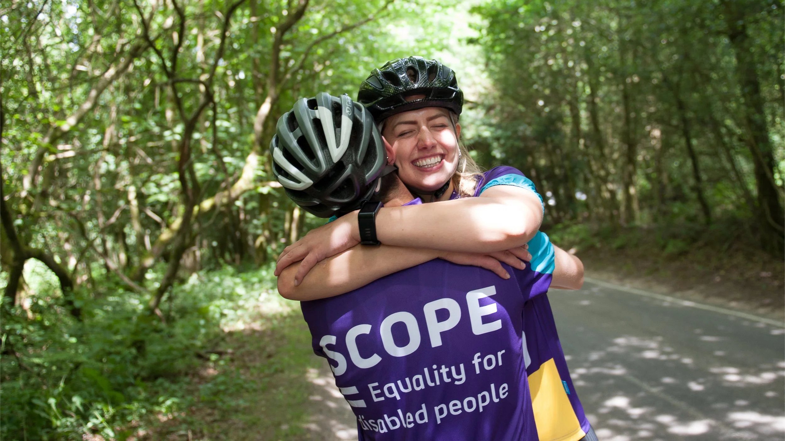
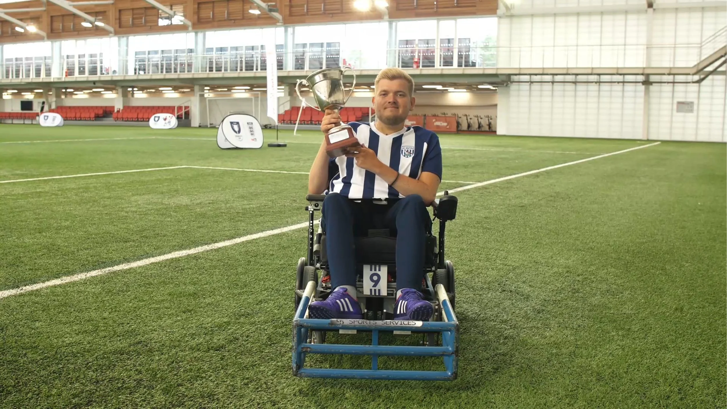
Photography is a powerful tool for showcasing disabled people’s real-life stories by sharing relatable moments. We collaborated with photographers to establish ways of working that upheld people’s dignity when capturing their story.
The new journalistic approach shows what disability inequality and equality looks like – the good days and the bad days – and demonstrates Scope’s work in action.
To visualise visible and invisible disabilities, we created a bespoke illustration style that was both unambiguous and creative, and able to support diversified characters with sensitivity.
At launch, we held a Brand Breakfast to share our journey on inclusive design with sector peers. This poster was an inspirational give-away, with tips on how accessibility can play a key role in any brand.
“Our brand overhaul has been a huge success for Scope and a pleasure in the process too. Their quick understanding of our unique brand challenges was impressive from the offset. Thanks to The Team we have a truly game changing brand for our sector.”
— Danielle Wootton, Head of Brand and Marketing, Scope
© Created at The Team


