Inside Asia
Industry
Travel & Hospitality
What we did
Brand Strategy, Visual Identity, Verbal Identity
Challenge
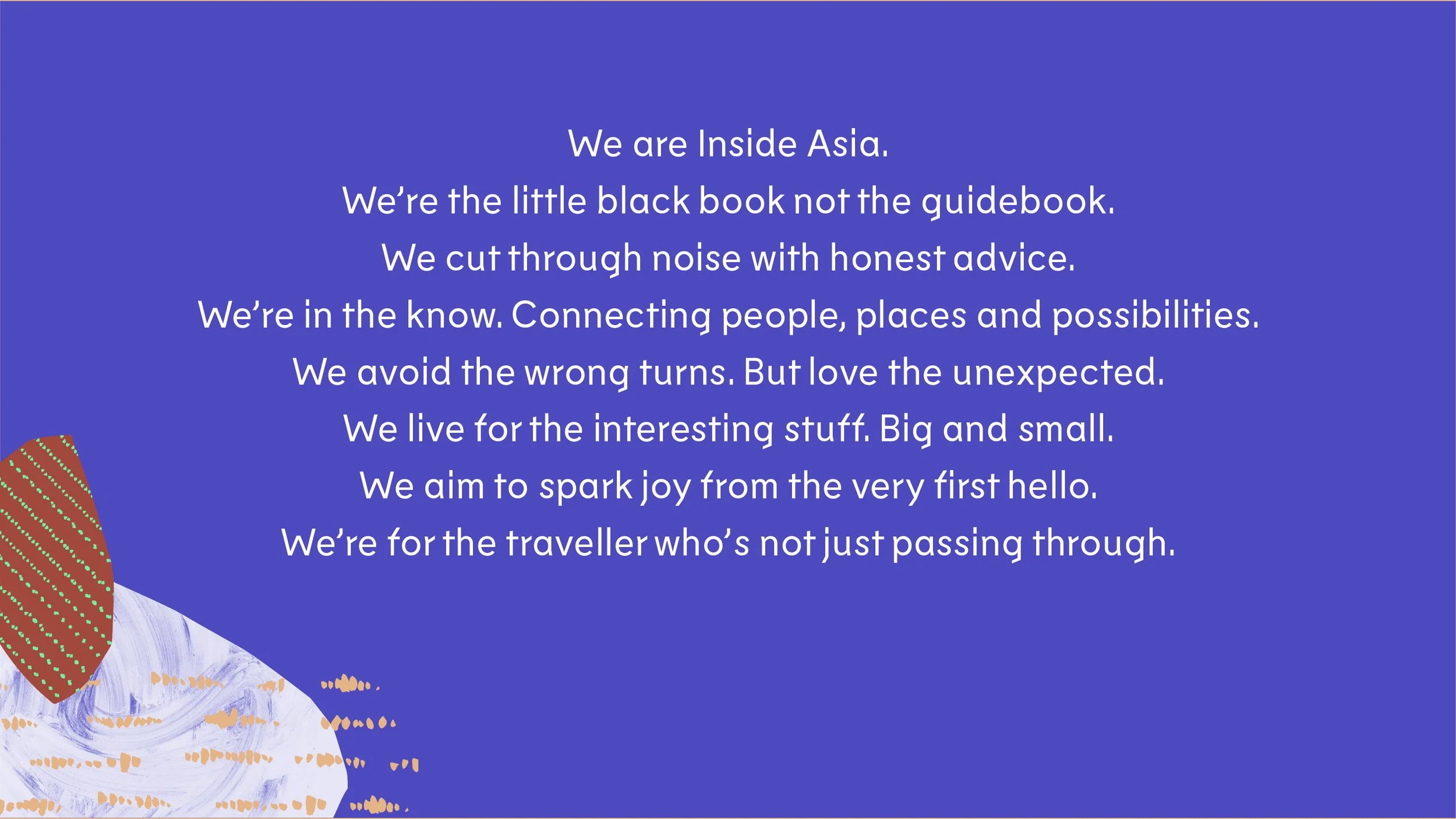
Inside Asia are travel specialists with a difference. They’re the little black book of Asia, not the guidebook. However, their passion for sharing their love of Asia and sparking joy with fellow travellers wasn’t coming through.
Our challenge was to help Inside Asia articulate a brand strategy that would underpin the organisation and help differentiate them in market.
Strategy
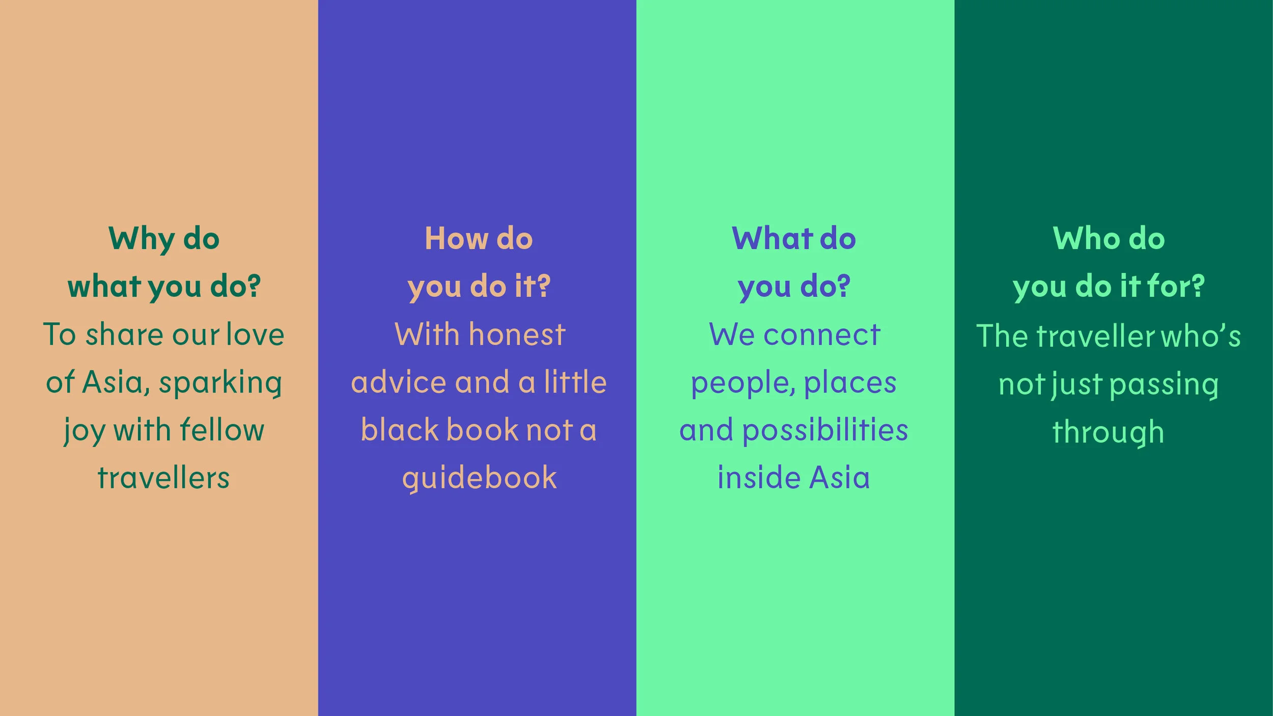
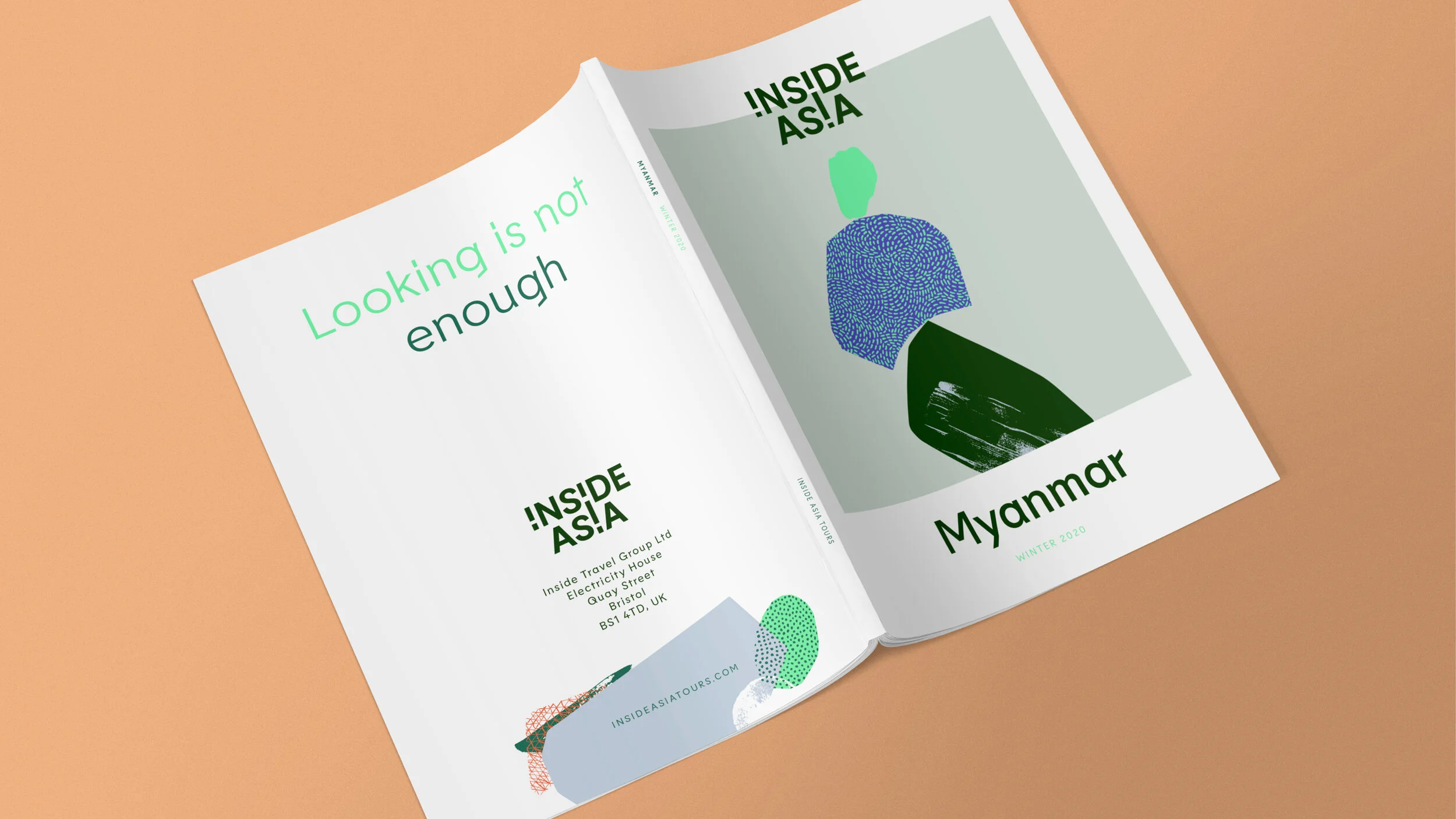
We started with an immersive brand DNA workshop to co-create the brand platform. We saw that their inside knowledge from living as a local, coupled with honest advice, distilled into a truly unexpected, joyful experience for the traveller who’s not just ‘passing through’.
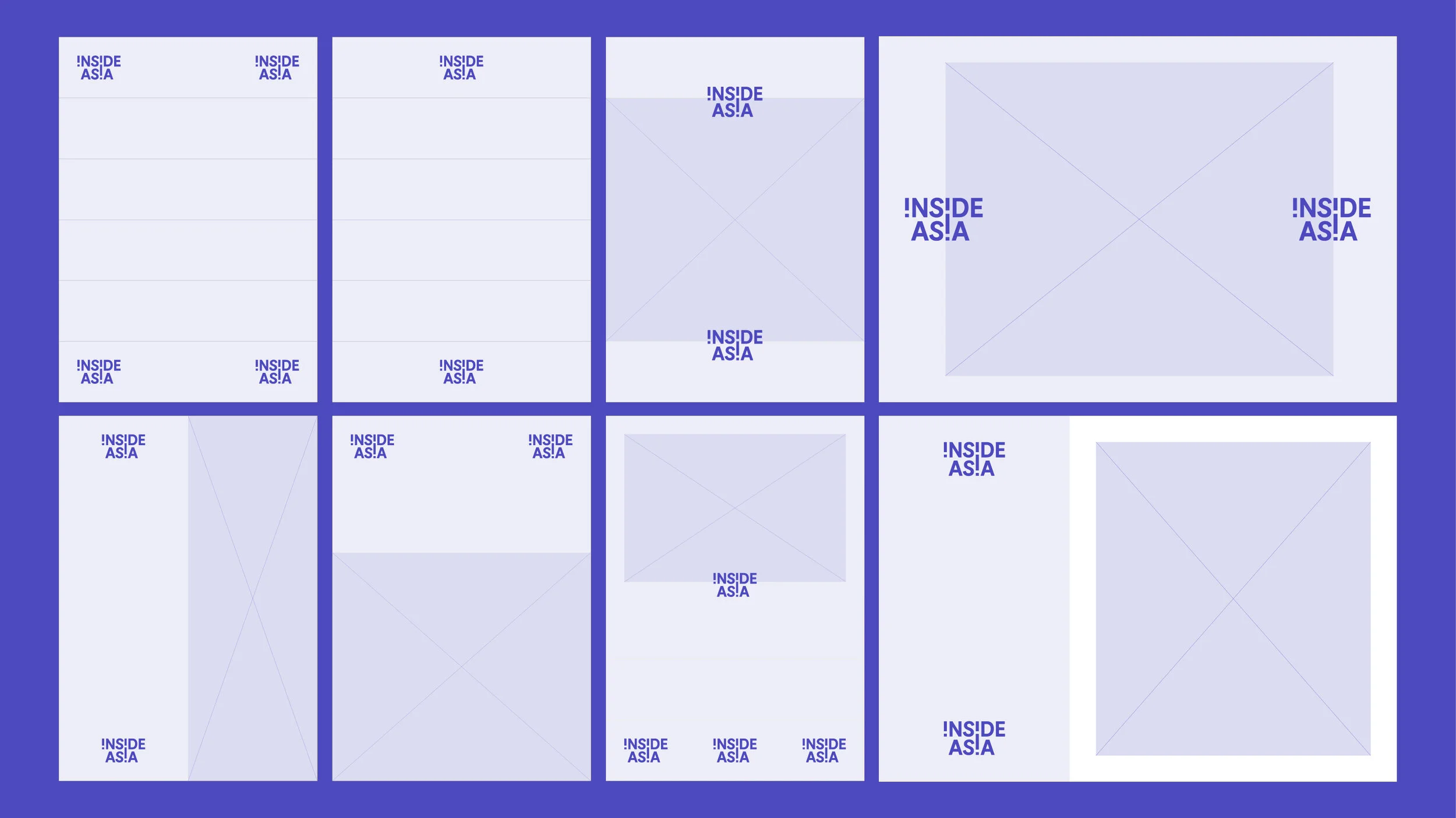
Brand system
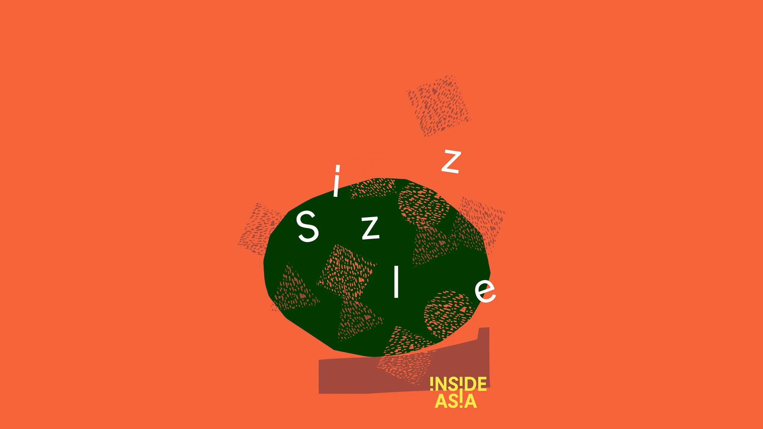
The concept of ‘turning Asia inside out’ was developed into a brand expression that turned an immersive experience into one that you can see, hear, touch and taste. The result is an exciting and eye-catching design system with bags of passion and joy. The new logo sparks joy through its playful letterforms and interacts with other graphic elements using a simple interlocking system.

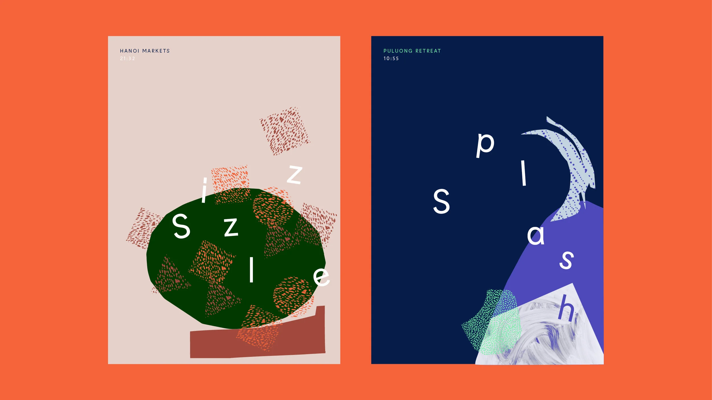
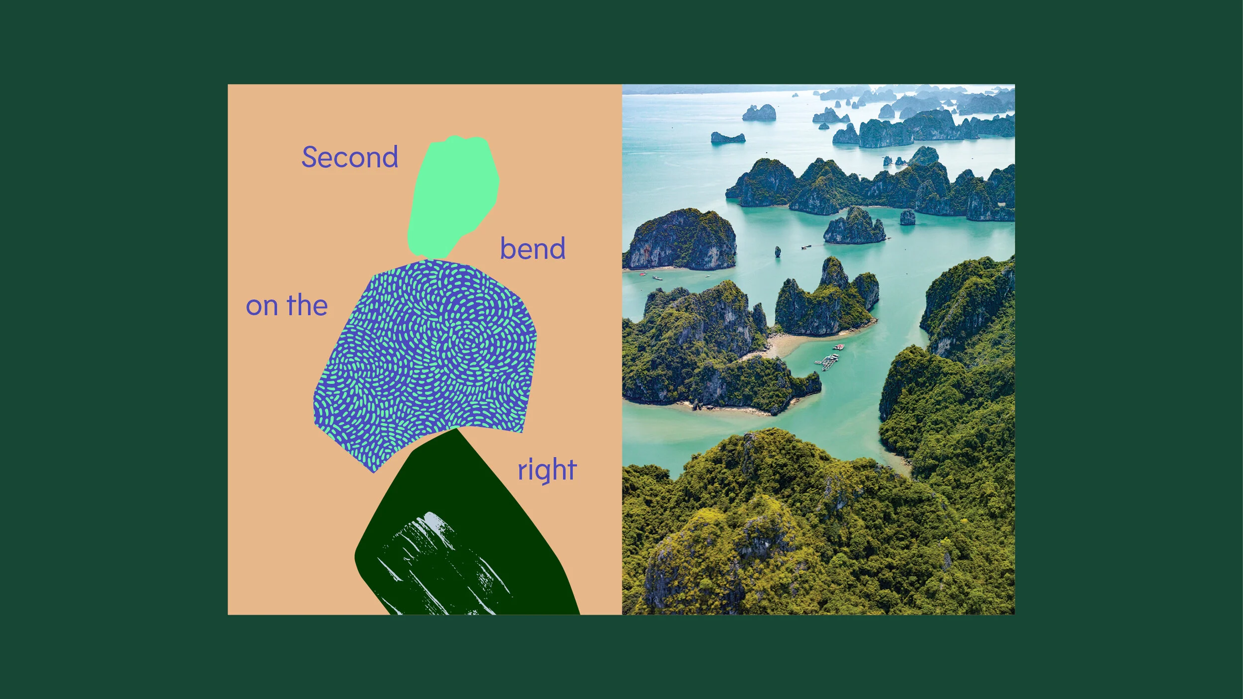
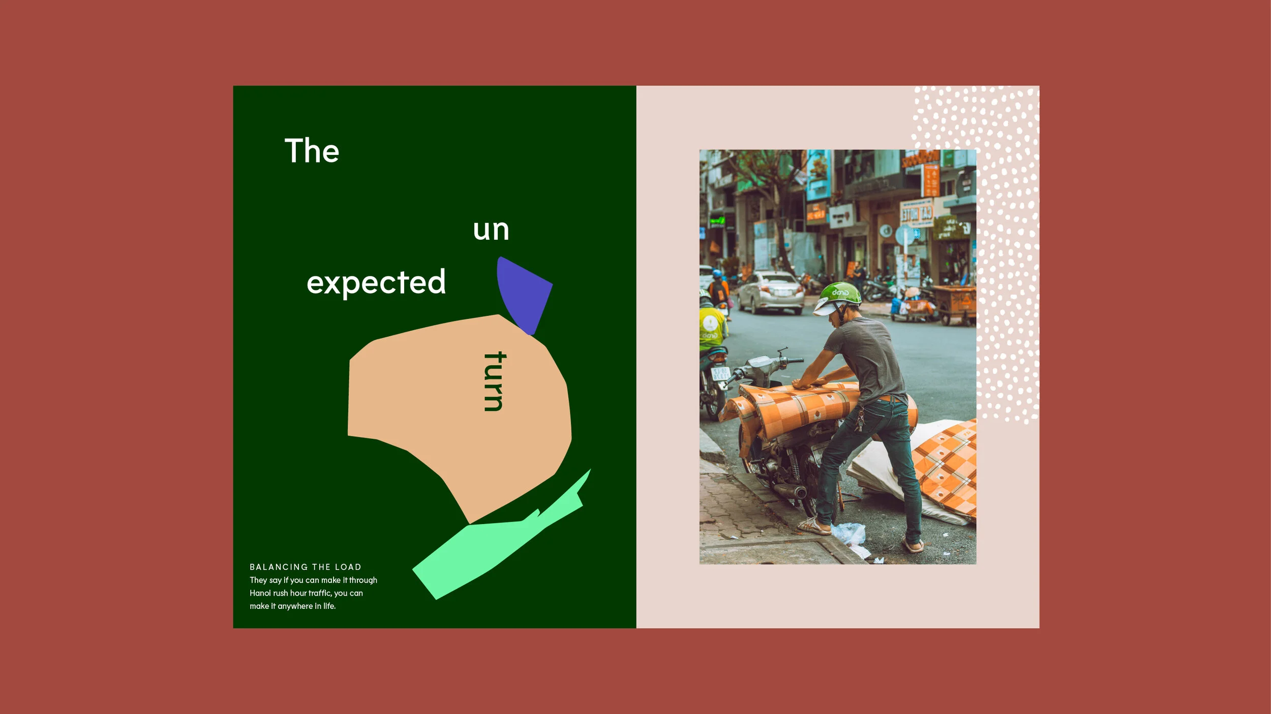
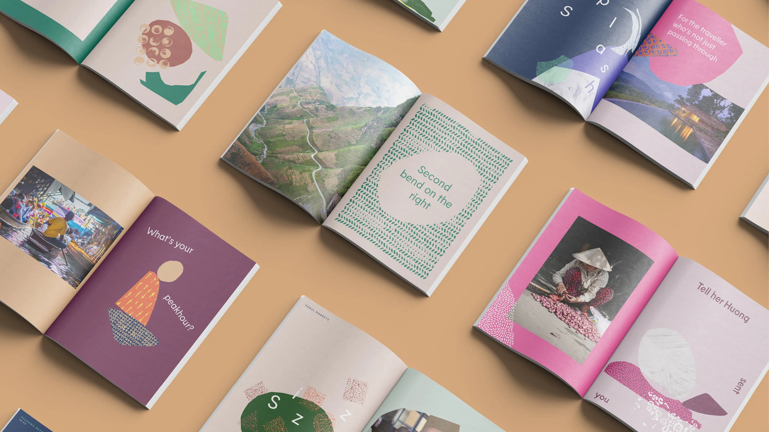
Central to the expression is an illustration system that creates limitless possibilities, reflective of the myriad of Inside Asia experiences. Loose, organic shapes are cut from areas within an image and rearranged into new, abstract compositions. The shapes are filled using a multi-dimensional colour palette that dials up or down to create different moods, and a carefully curated set of textures reminiscent of the region complete the picture.


Expressive typography responds to the graphic shapes, creating dynamic compositions.
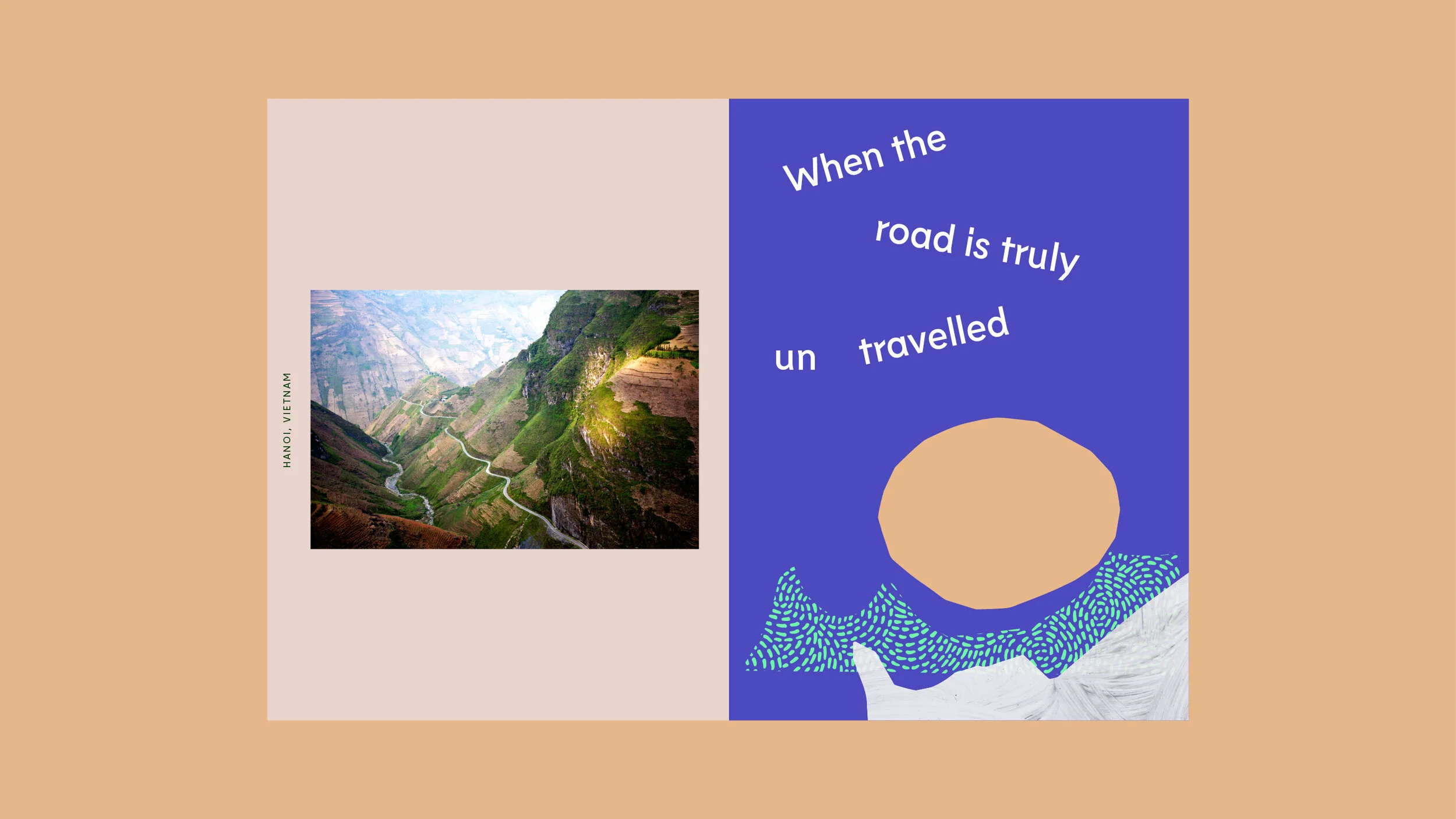

We also expanded their photography style beyond the usual beauty shots and developed tone of voice principles to better reflect their renewed brand personality.

© Created at The Team