NS&I
Industry
Financial Services
What we did
Brand Strategy, Visual Identity, Verbal Identity, Brand Activation
Collaborators
Monotype
Challenge
NS&I is the UK government’s savings bank driven by a refreshed purpose to inspire a new generation of lifetime savers and improve their existing savings experience. The emergence of digital banking and an ageing customer base meant NS&I needed a brand that could attract a much broader spectrum of existing and future savers to remain relevant.
Strategy
To achieve these goals, NS&I needed a clear, differentiating angle and strong brand presence. With a fantastic heritage and refreshed purpose, we knew NS&I had a great story to tell. Their unique position guarantees that 100% of your money is safe — something nobody else can offer. This makes them the perfect place to start saving.
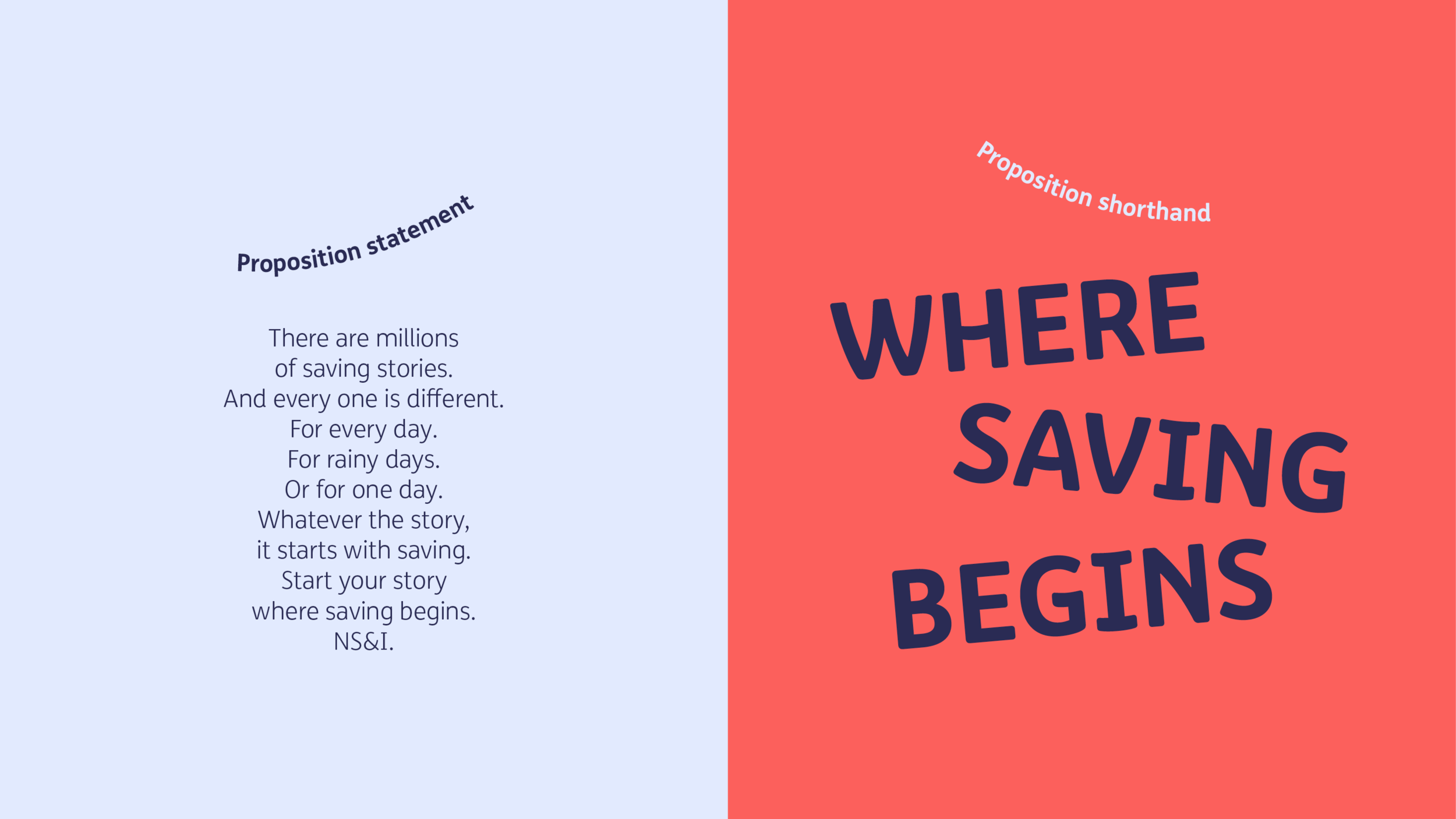
We worked with NS&I to develop the brand proposition ‘Where saving begins’. The brand took shape over a series of sprints, where we worked closely with NS&I’s other creative agencies to ensure the brand worked at a promotional and sales level too.
Brand system
The visual identity was rebuilt to reflect a new brand expression – ‘A springboard for saving’. An energising and active representation of a brand that inspires everyone to save confidently. The ‘springboard effect’ stretches across the entire graphic system.
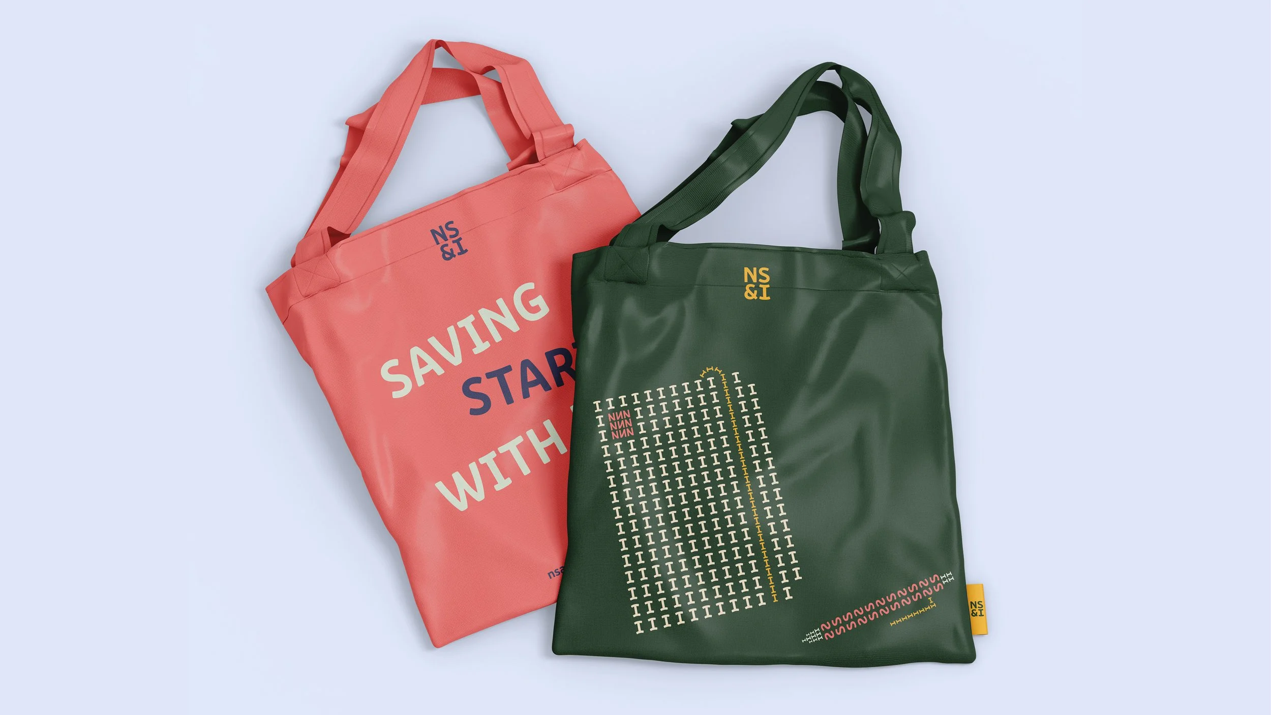
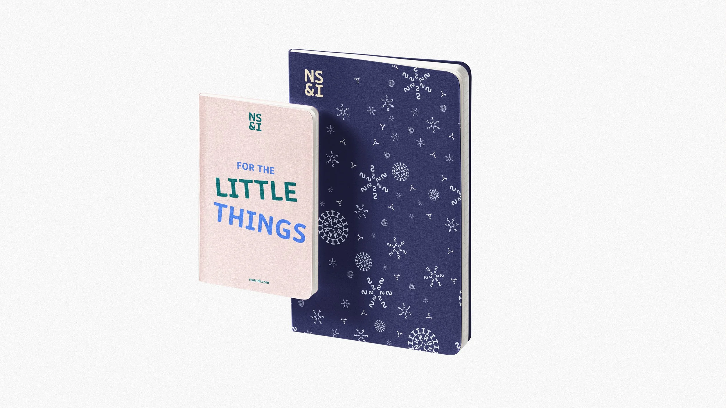
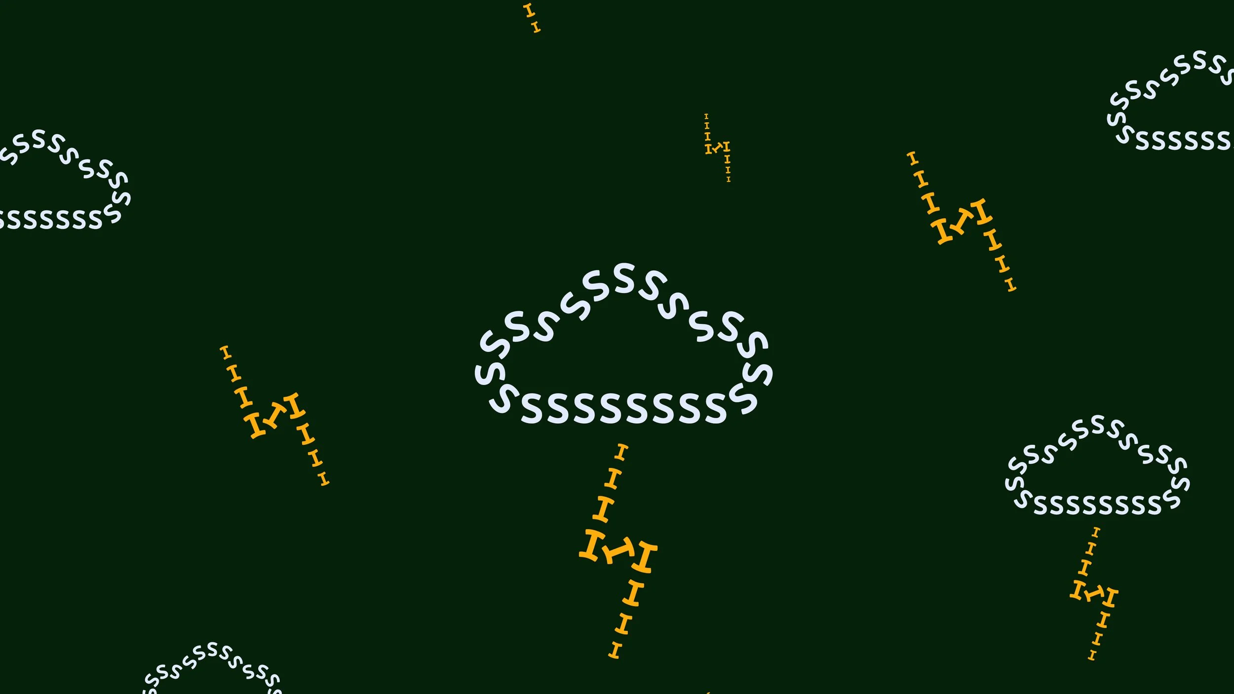
The logo uses the notion of a springboard to shape and animate its letterforms. The graphic language and refreshed photography style bring real customers and their saving stories into play. Expressive messages combine with bespoke typographic illustrations made from the letters NS&I and photography in a simple and differentiated way.
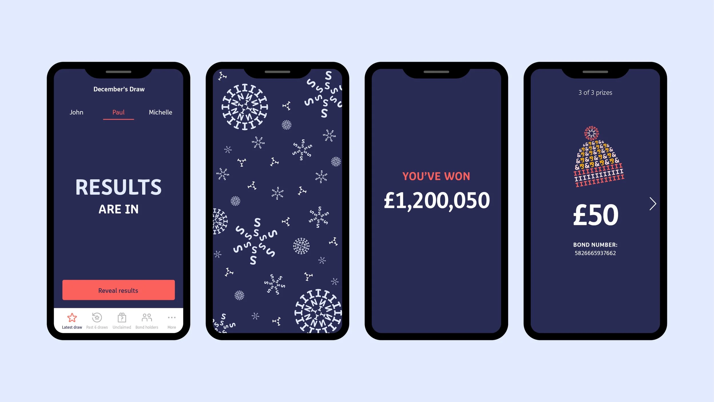
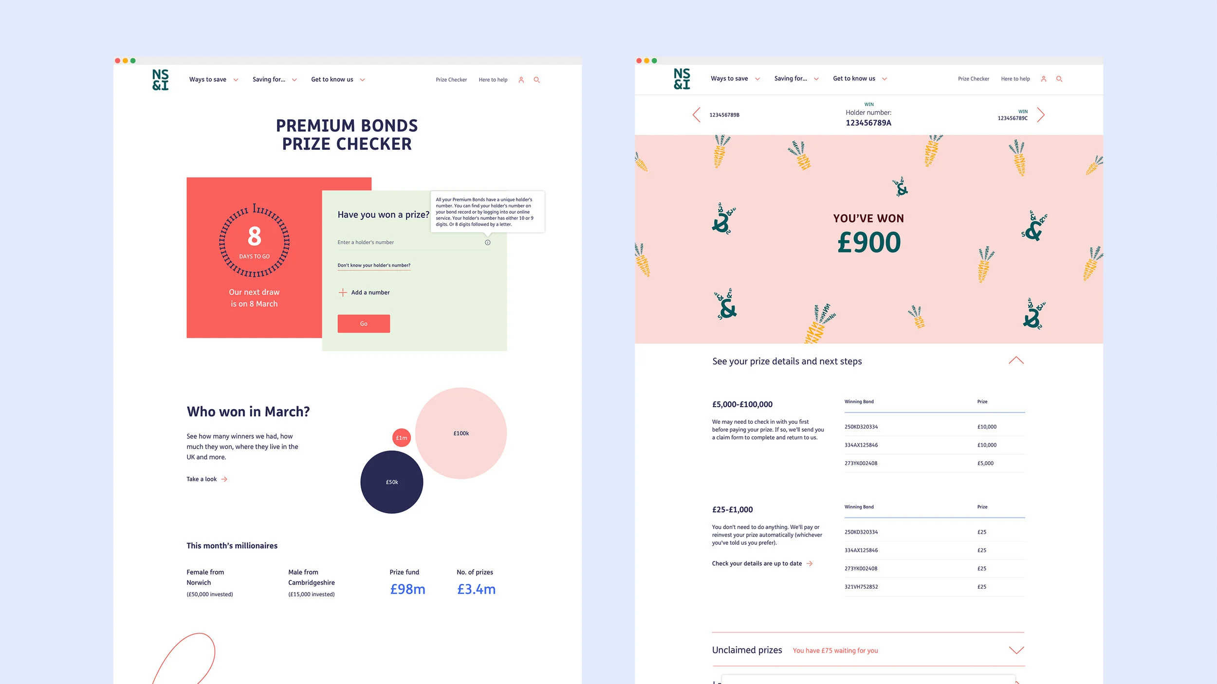
The Premium Bonds prize checker app uses seasonal animated illustrations to bring year round excitement and anticipation to the prizewinning experience.
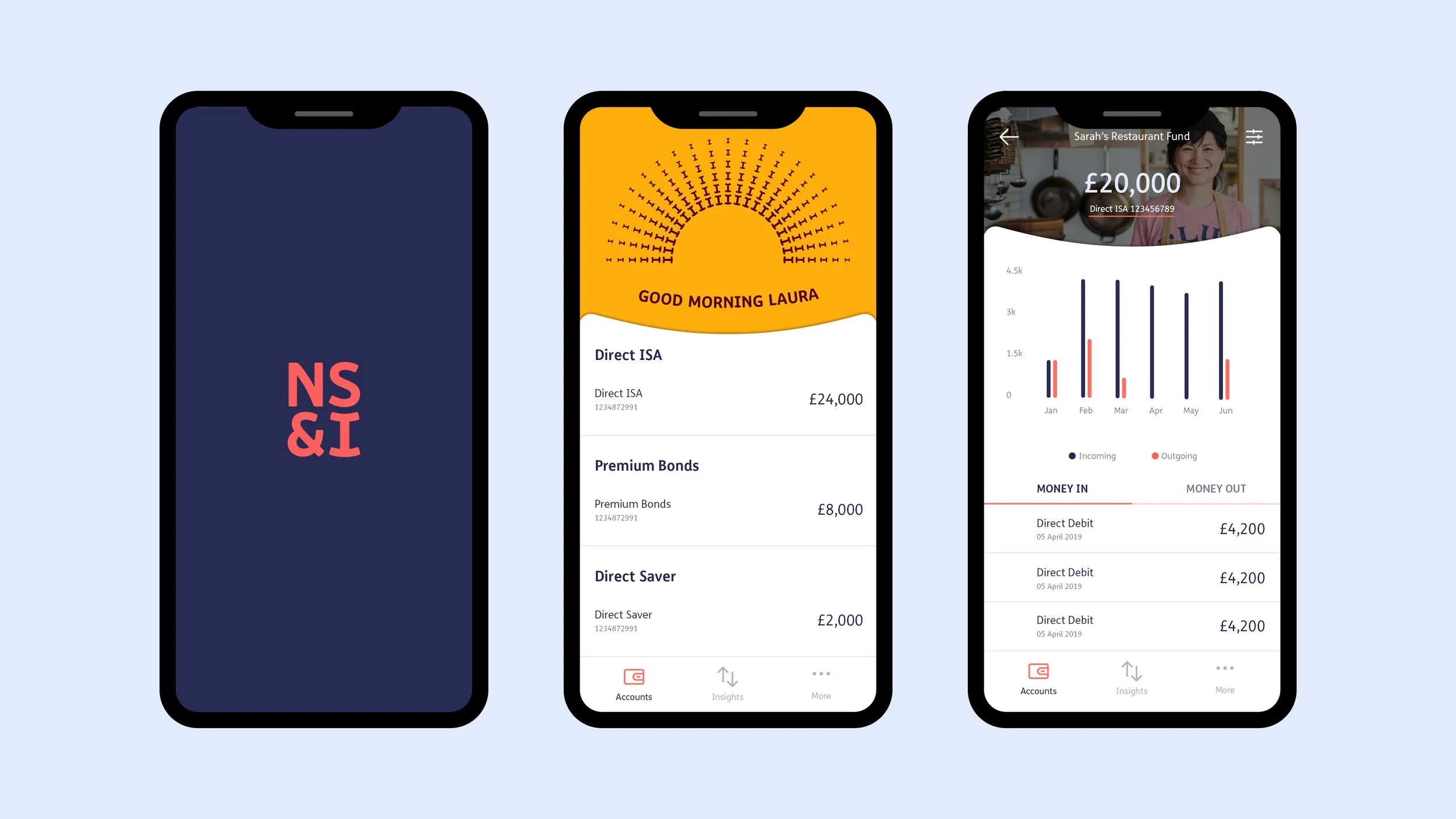
The brand personality enhances the transactional app’s user experience through animation and micro interactions.
“I have worked with and alongside creatives for 30 years and I see in Clare an outstanding ability to see, feel, comprehend and ultimately express the subtlety and nuances that brands need to speak to people. She brings a way of thinking about brand expression and campaigns that I very rarely see. I have met many creatives — not many like Clare.”
— Eugenie Biddle, NS&I
© Created at The Team


