Rightmove
Industry
Internet & Real Estate
What we did
Brand Strategy, Visual Identity, Verbal Identity, Brand Activation
Challenge
Rightmove is the UK’s number one property website. But back in 2017, they had market competition hot on their heels and their brand had become fragmented across both B2B (estate agents) and B2C (home searchers) consumers.
With a new brand strategy and purpose, we helped them retain their market leading position and create a more emotive brand that reflected their proposition and strapline ‘find your happy’.
Strategy
Knowing that modern brands need to be built on human emotions to be successful, we saw a market opportunity for a more emotive brand positioning.
We worked with Rightmove to define a new Brand Purpose (Empowering the UK’s Property Decisions), Customer Proposition (Find your happy) and Personality (Friendly Expert).
The positioning was brought to life through the visual identity, user experience and tone of voice. We also tidied up their brand architecture, sweeping away unnecessary sub-brands to create a much stronger monolithic master brand.
Brand system
Inspired by the well-known proverb ‘home is where the heart is’, we enhanced the emotive quality of the brand. And created a flexible design framework to work on and offline throughout the user experience for both B2B and B2C consumers.
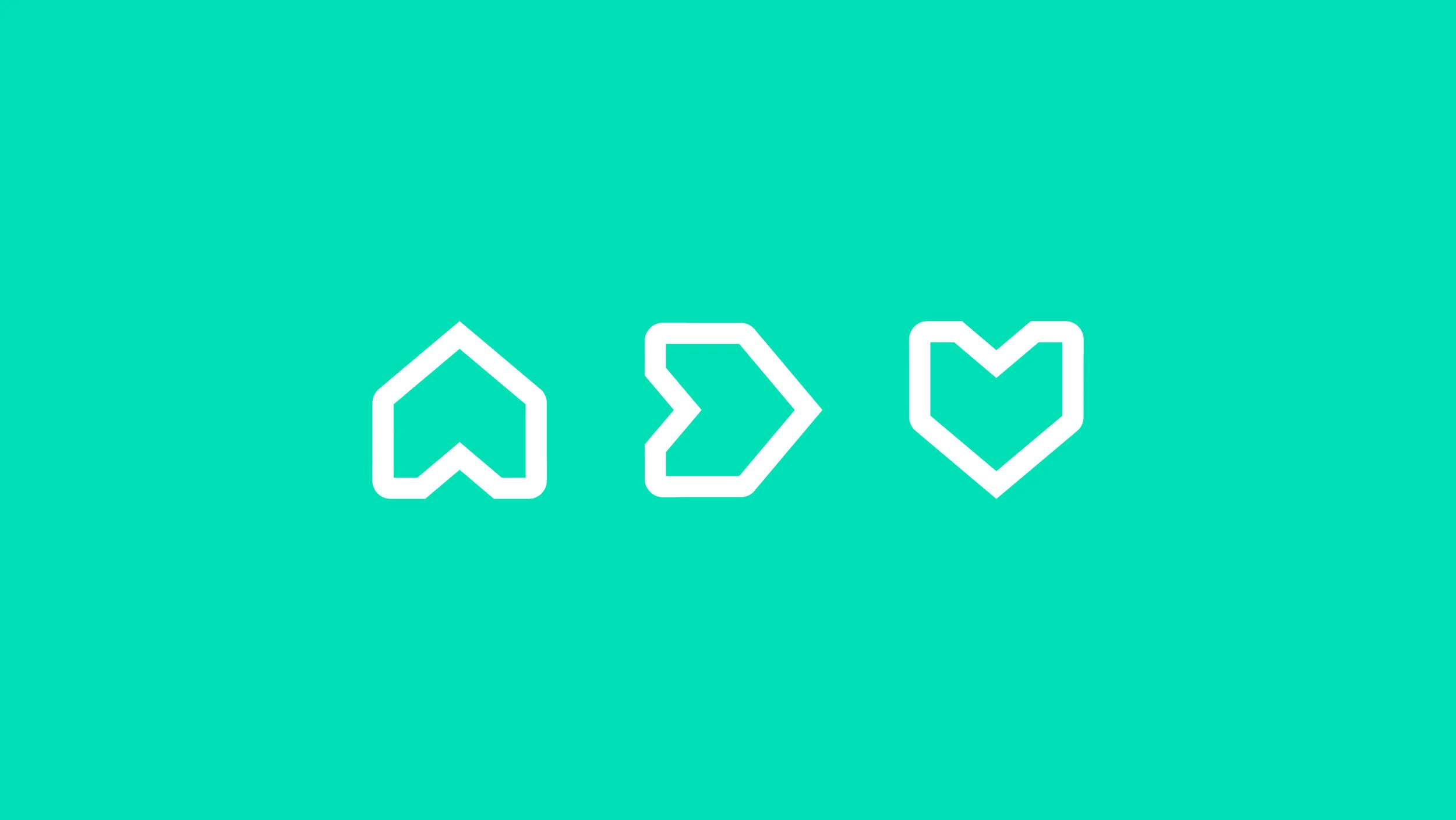
Rightmove’s original logomark of an arrow and a house has evolved into a digital friendly, dynamic symbol. With a simple 90 degree rotation, the adaptable symbol actively tells the story of finding a happy home.
Expressive doodles built around the symbol bring human warmth and emotion.
“From start to finish The Team pushed the concept with great enthusiasm, lots of creative juices and attention to detail. It was a pleasure collaborating with them, testing and validating the concept and getting to embrace it and own it.”
— Odeya Noble-Bougay, Head of Design, Rightmove
© Created at The Team


