Muscular Dystrophy UK
Industry
Non-profit
What we did
Brand Strategy, Brand Architecture, Visual Identity, Verbal Identity, Brand Activation
Collaborators
Brand Dufour
Challenge
Muscles. We use them to move. Walk, eat, smile, cry. Pump blood around our bodies. To breathe in and out. Muscles keep our bodies fit and healthy, so we can do everything we want to. Our muscles matter.
Living with a muscle wasting and weakening condition can be exhausting, stressful and lonely. That’s why, for over 60 years, Muscular Dystrophy UK have been building their community. They are the leading charity for over 60 muscle wasting and weakening conditions. Connecting more than 110,000 people personally affected, and all those around them.
Strategy
We found that the brand tended to jump straight into explaining ‘what’ it does, without explaining ‘why’ it exists. We know that explaining ‘why’ can help to build empathy and consideration to support, and so it was really important to add why our muscles matter.
The brand personality became The Real and Human, Strong Community. A Real and Human Challenger Brand is one that puts people at its heart. The Strong Community reflects strength in numbers. This is brought to life with one set of values which guide the brand on the inside and the brand on the outside: Always Here, Stronger Together, Forward Thinking, Never Stop.
A new purpose focusses on feeling good, mentally and physically.
Brand system
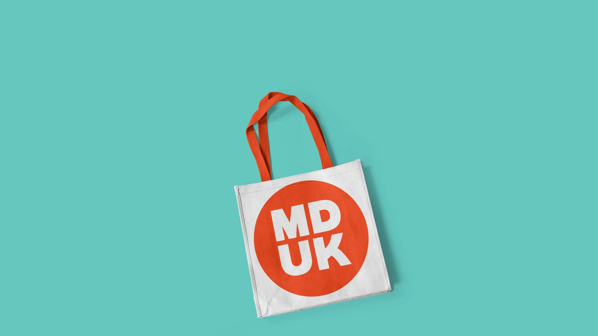
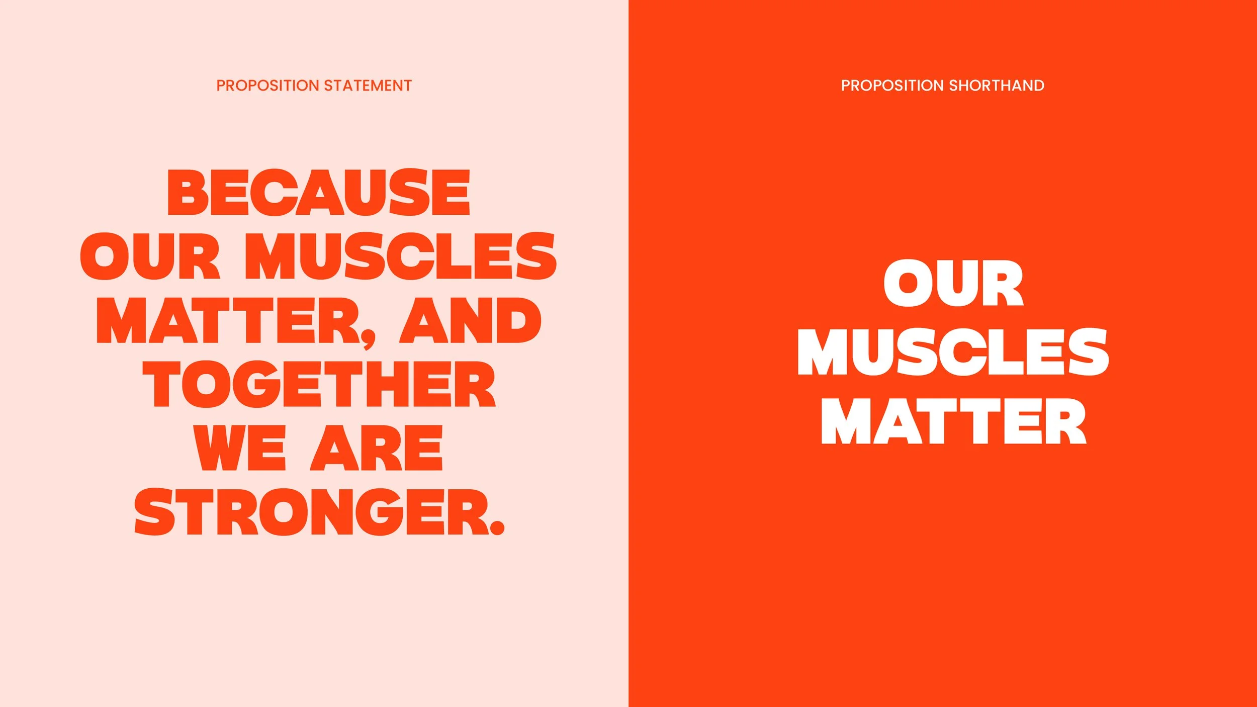
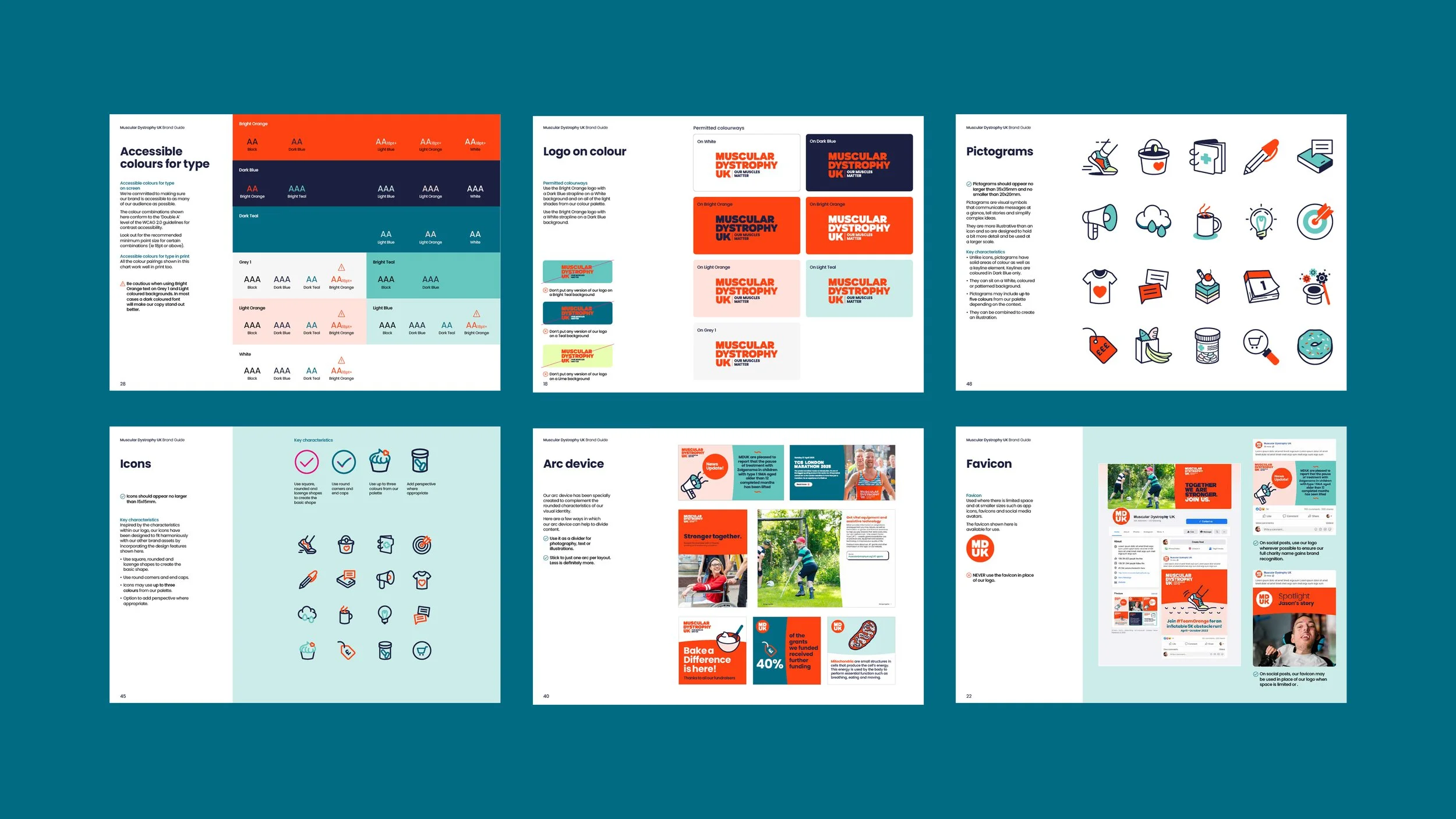
The new logotype is set in the characterful typeface Stout, in upper case to reflect the community’s collective strength. It has been carefully crafted to make it unique to the charity and is accompanied by the new strapline ‘Our Muscles Matter’.
Whilst orange is still the primary colour, it has been improved for accessibility. Complimentary shades of teal and lime have been added for contrast and to bring modernity to the brand.
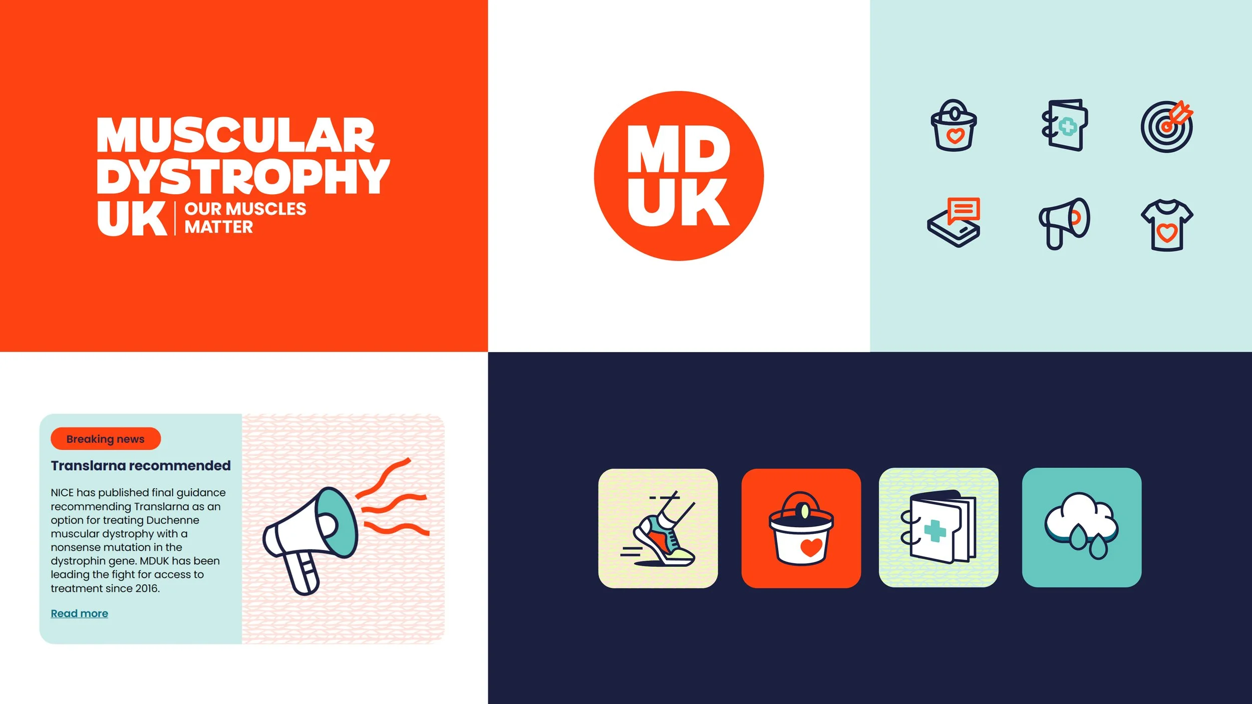
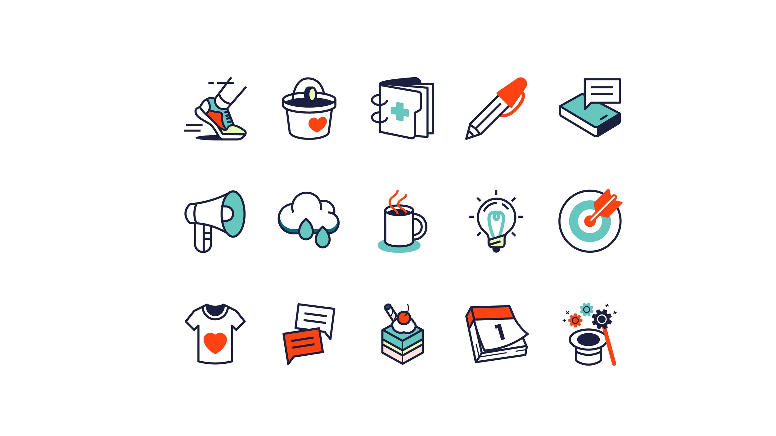
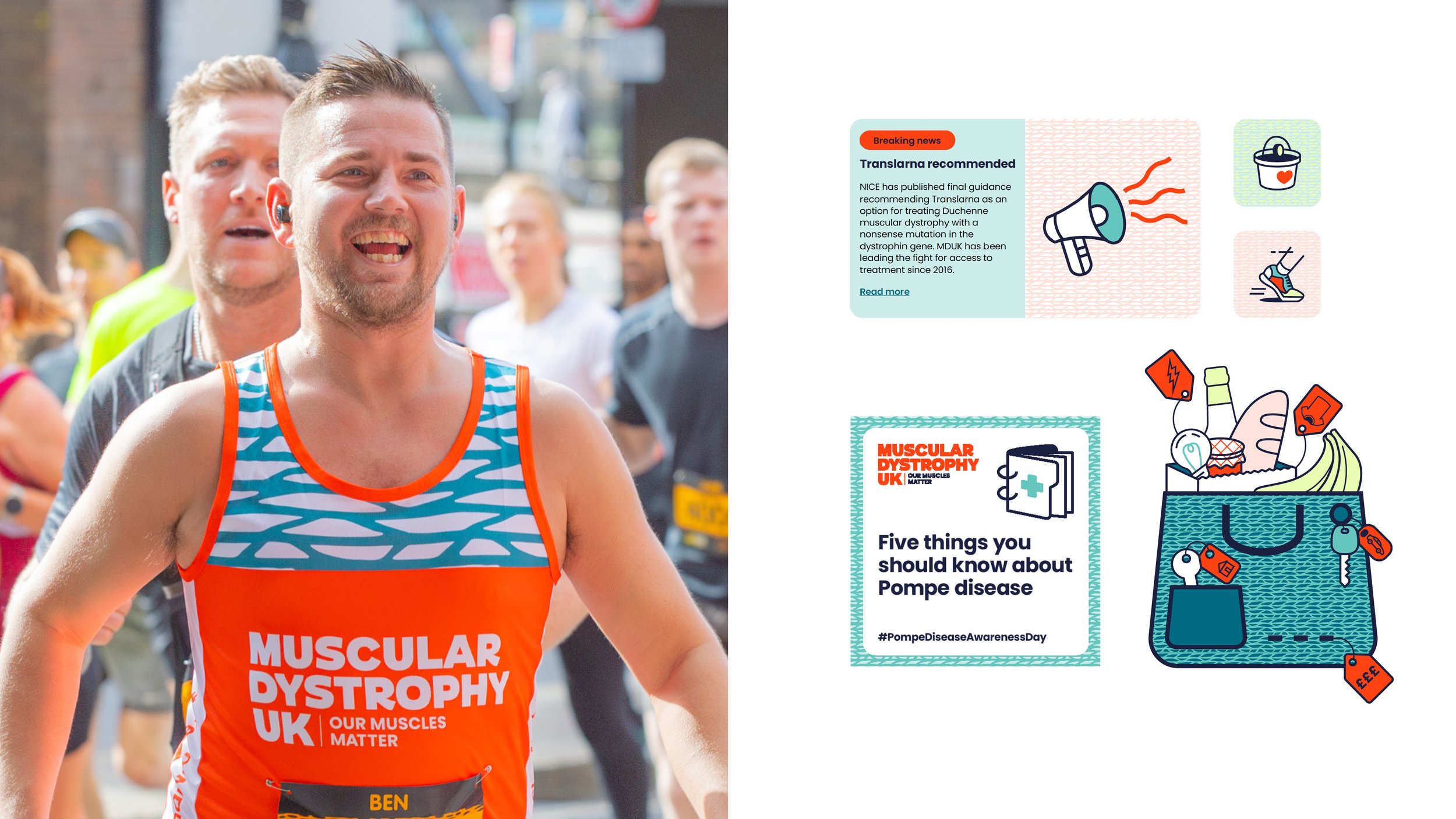
Friendly and impactful visual symbols communicate messages at a glance, helping to tell stories and simplify complex ideas.
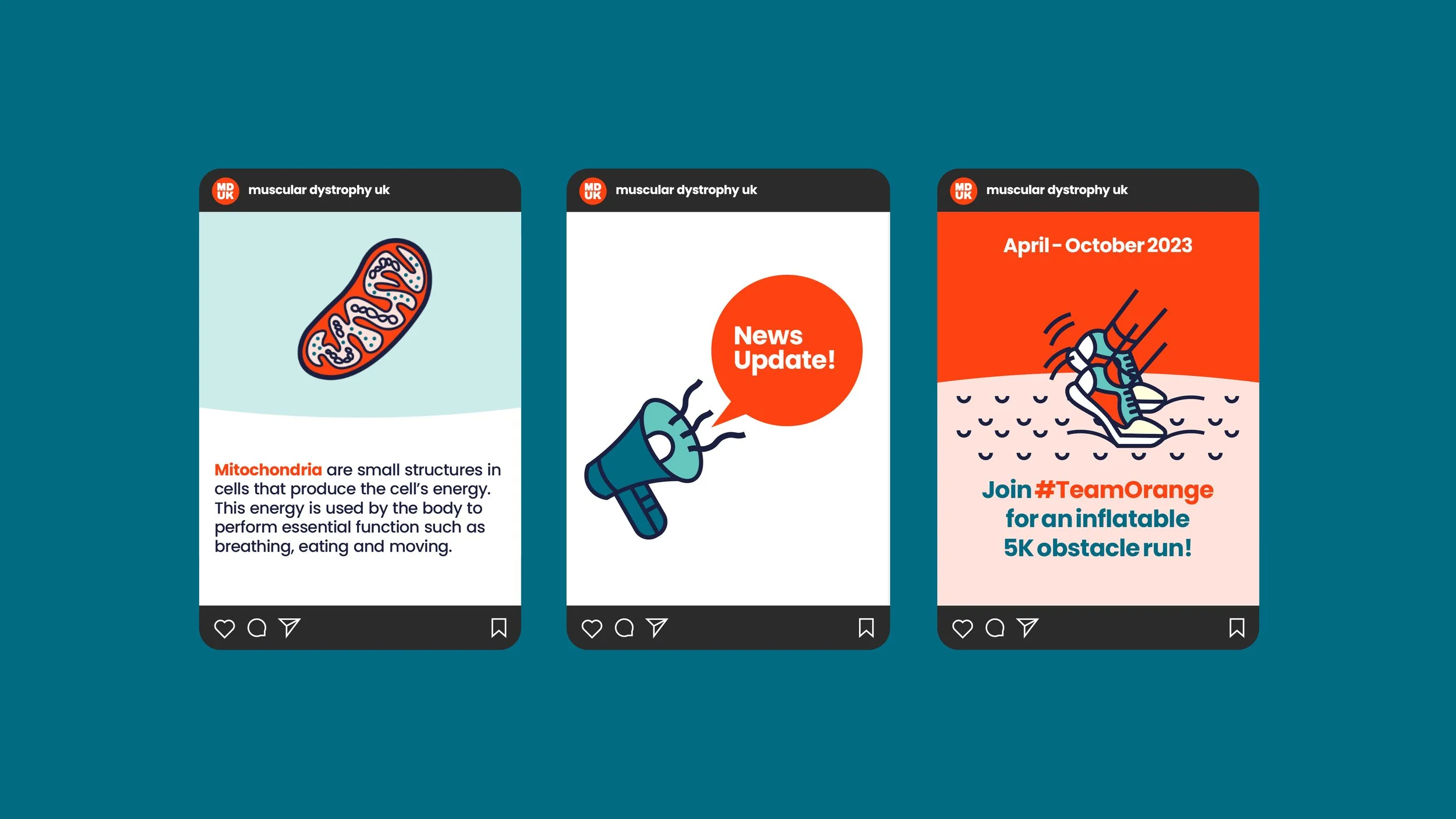
Graphic patterns, inspired by microscopic images of muscle fibres, bring a very unique and unifying ingredient to the visual identity toolkit. They mean muscles can literally run throughout the branding, demonstrating the community’s collective strength visually.
The refreshed visual identity now has the strength and flexibility to fully express the charity’s powerful brand proposition. The muscle patterns in particular bring a uniqueness to the look and feel, helping to thread the story of why our muscles matter across every touchpoint.
© Created at Whirligig Creative