
Community Fibre
Industry
Technology
What we did
Brand Activation
Collaborators
James Carter Motion
Challenge
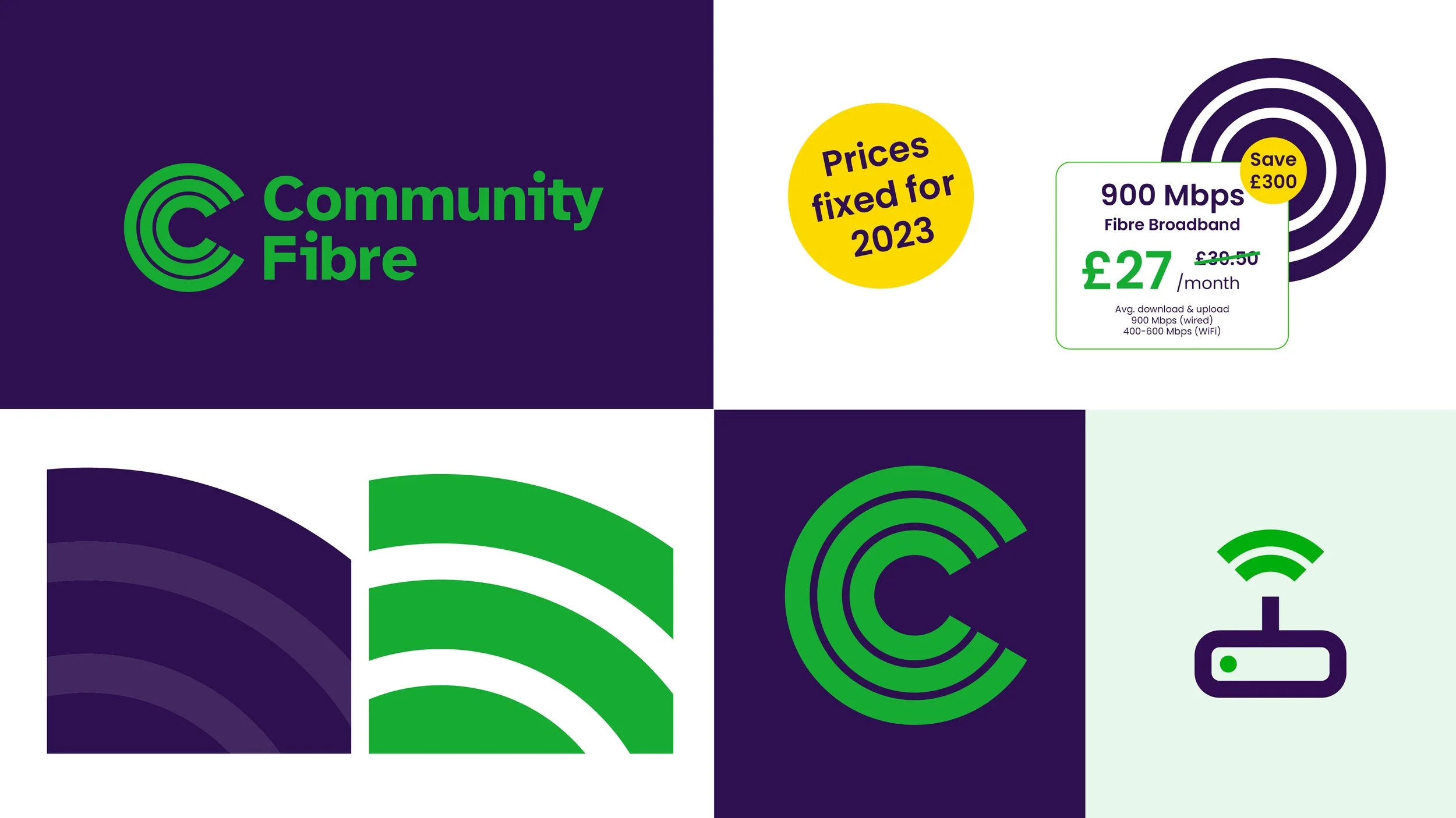
Community Fibre were on a charge to solidify its position as London’s leading independent altnet through a brand refresh centred on reliability, affordability, and rapid expansion to over 1 million households. Our challenge was to develop their new visual identity into a flexible and versatile toolkit capable of working across all touchpoints.
Brand activation
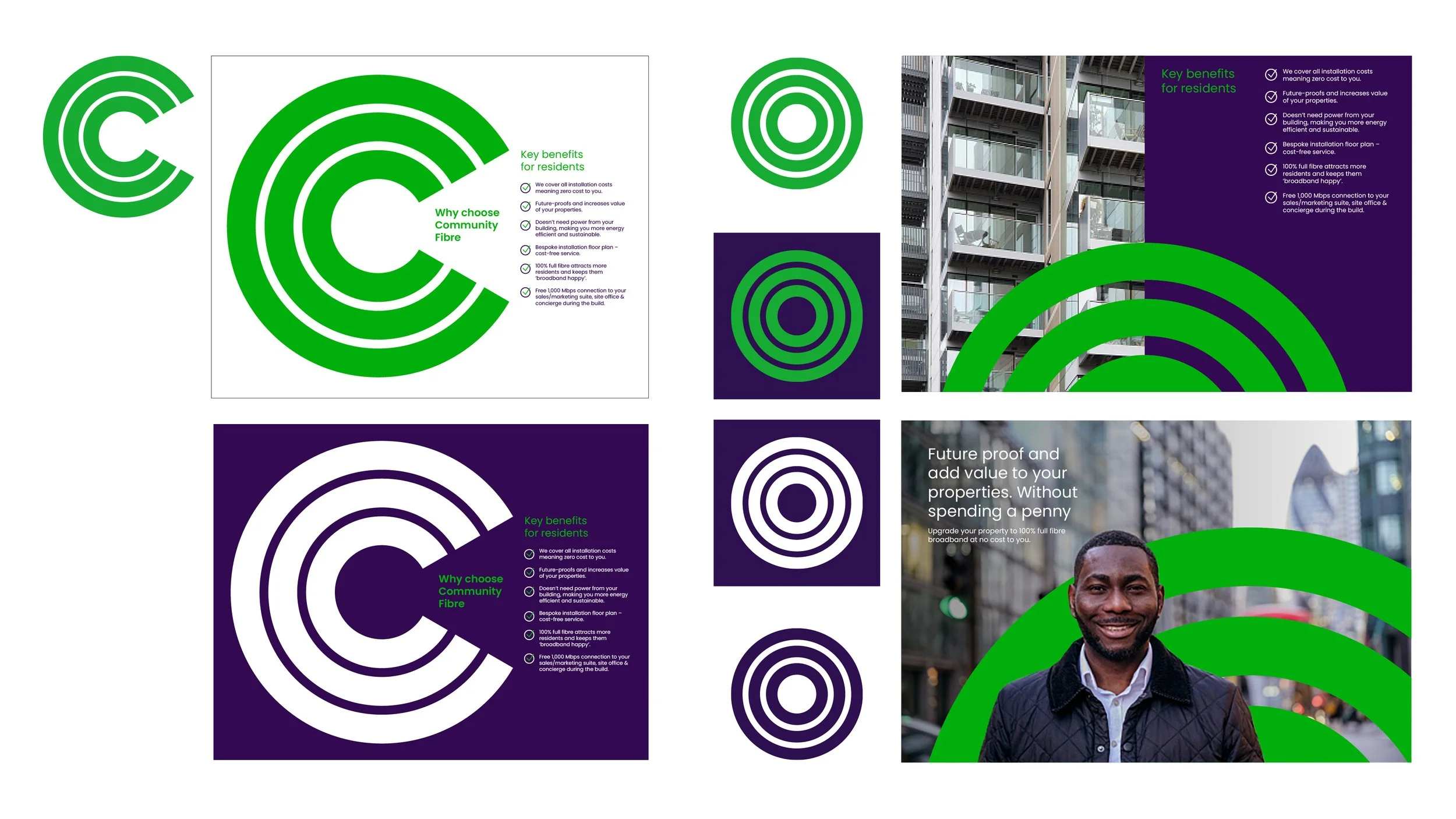
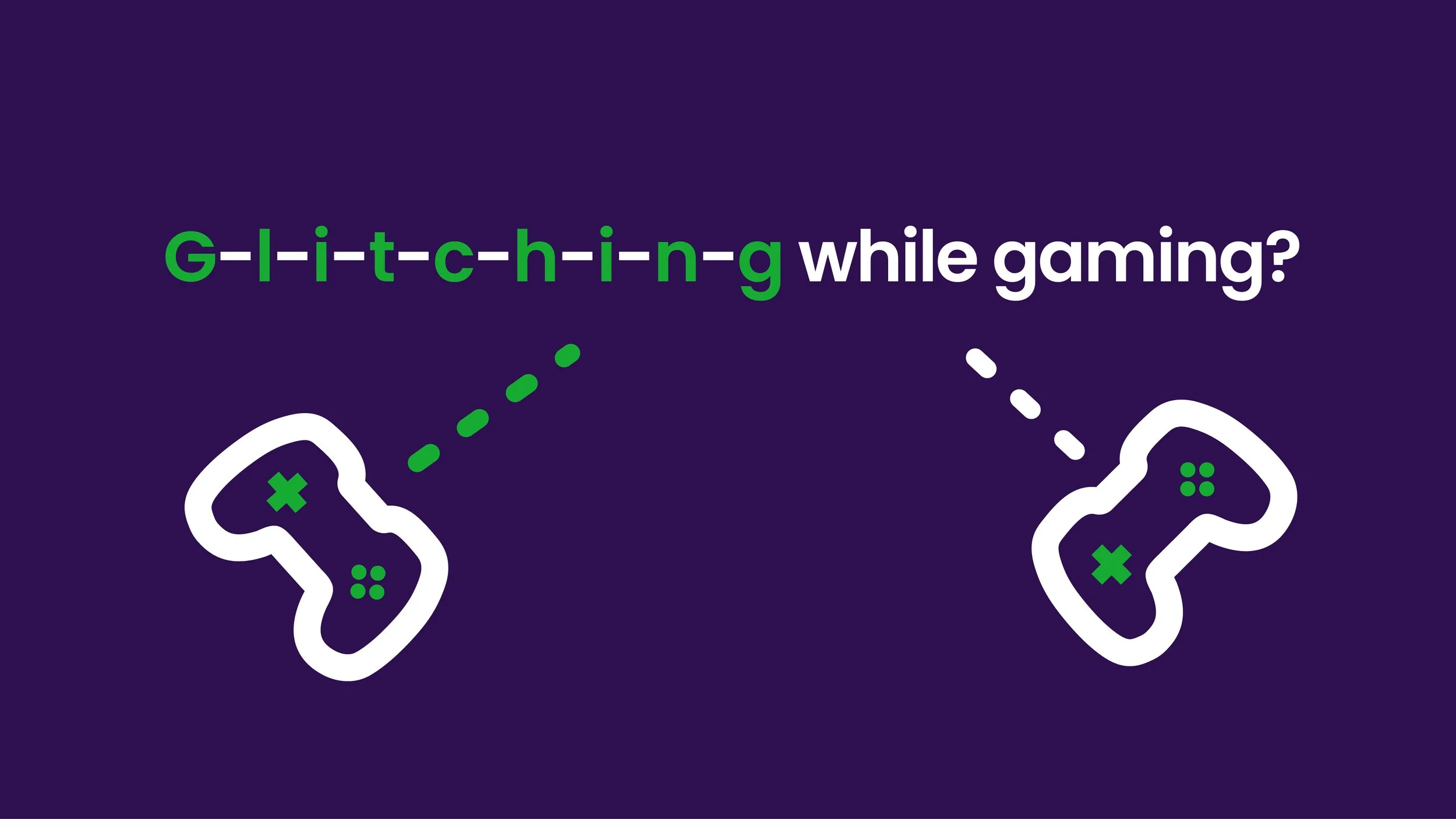
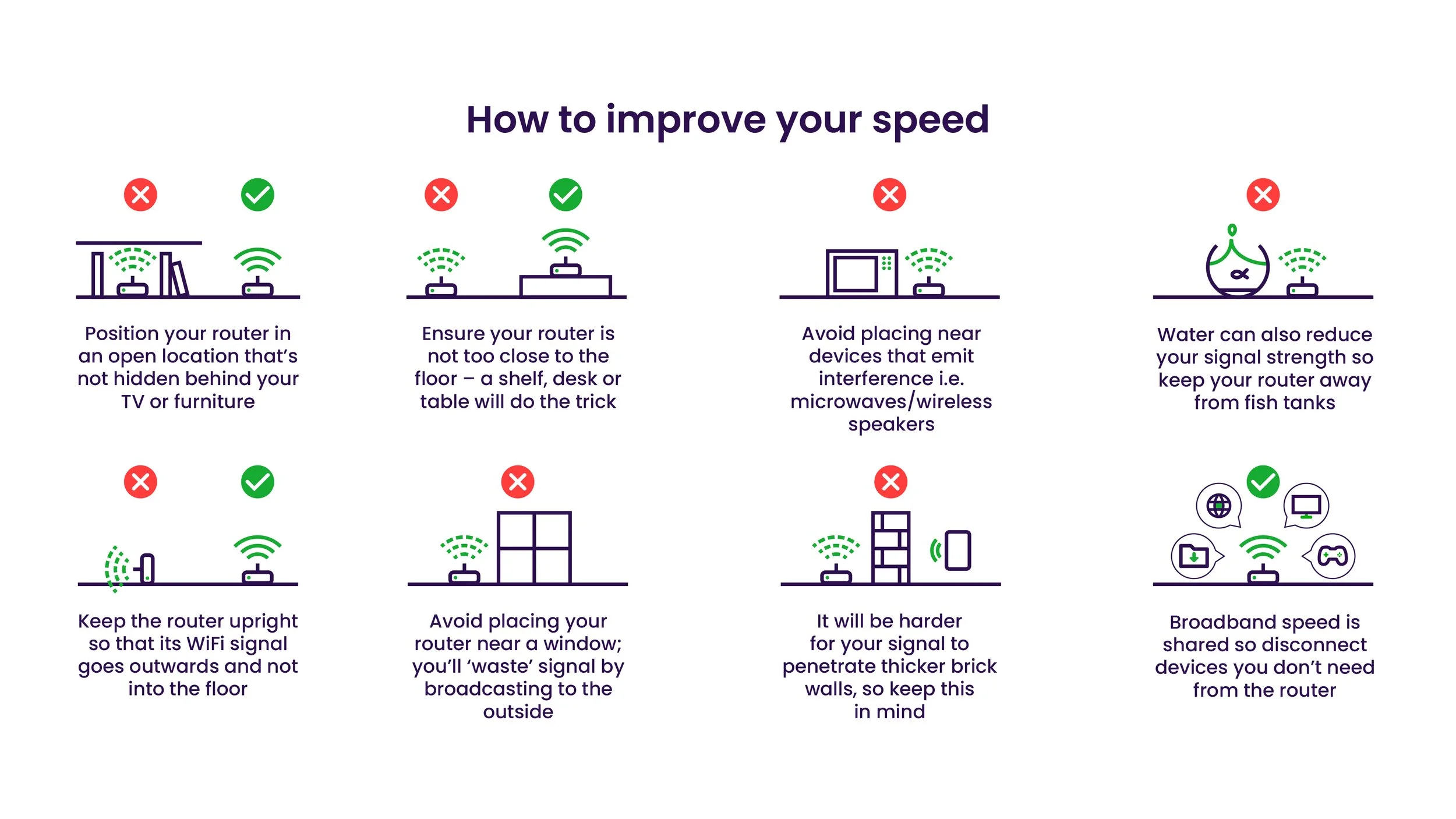
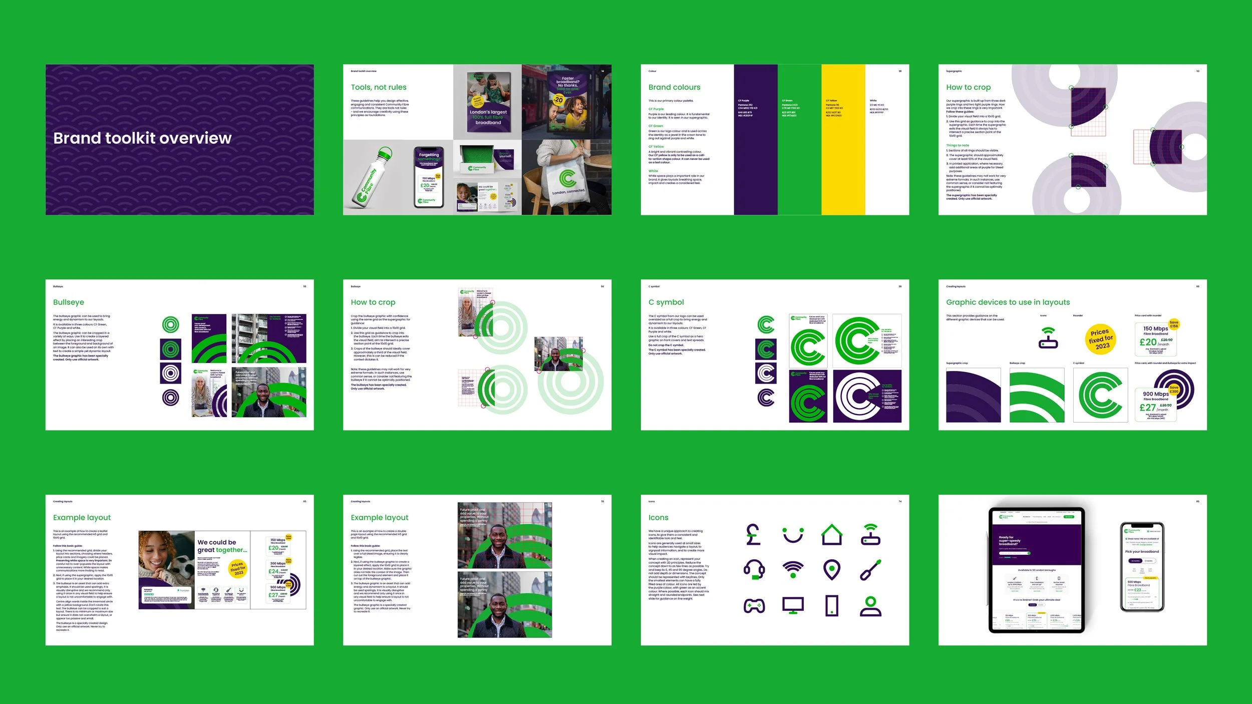
As part of the brand rollout, we created a set of comprehensive brand guidelines and motion principles which we applied across print and digital applications, including direct marketing, tutorials and explainer videos.
Brand system
The first step was to define the functionality of the C symbol, target and bullseye, three very distinctive graphic devices that would bring the brand to life.

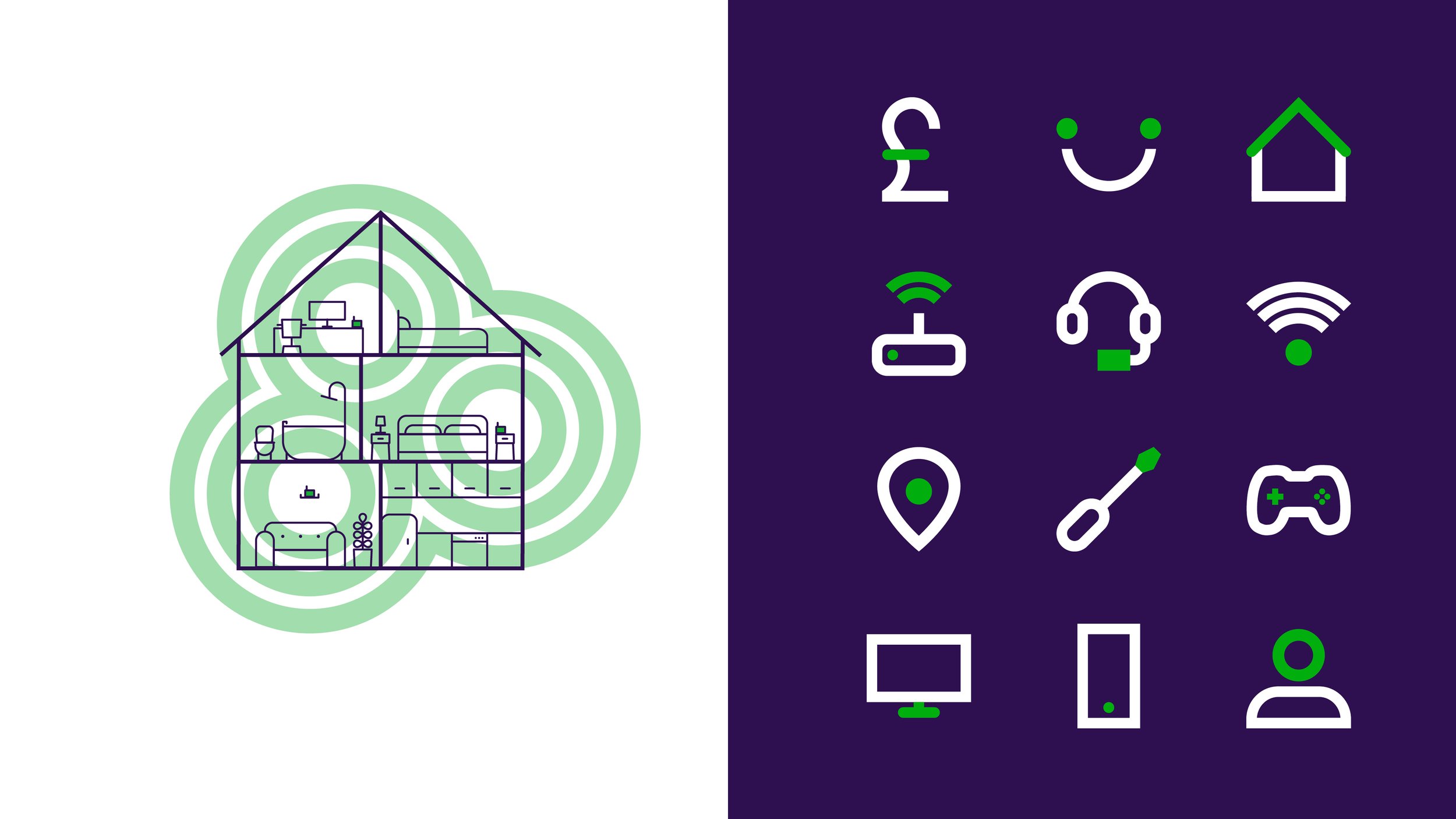
The concentric circles inspired a set of motion principles to guide the style of all motion graphics including the logo, captions and titles, instructional and explainer videos and infographics.
© Created at Whirligig Creative