
Sovereign Network Group
Industry
Social Housing & Residential Real Estate
What we did
Brand Strategy, Visual Identity, Verbal Identity, Brand Activation
Collaborators
James Carter Motion
Challenge
Sovereign Network Group (SNG) is a leading housing association, driven by their social purpose. Following a merger in 2025, they renewed their focus and ambition to provide good, affordable homes that are the foundation for a better life.
Our challenge was to refresh the brand identity by giving it a differentiating angle that matched their fresh perspective.
Strategy
We immersed ourselves in their world, visiting property developments and undertaking intensive market research and analysis. We saw that SNG gives people more than they expect from a housing association. They do more to provide people with a choice of high quality housing, rethinking the way we live and creating possibilities for customers.
Brand system
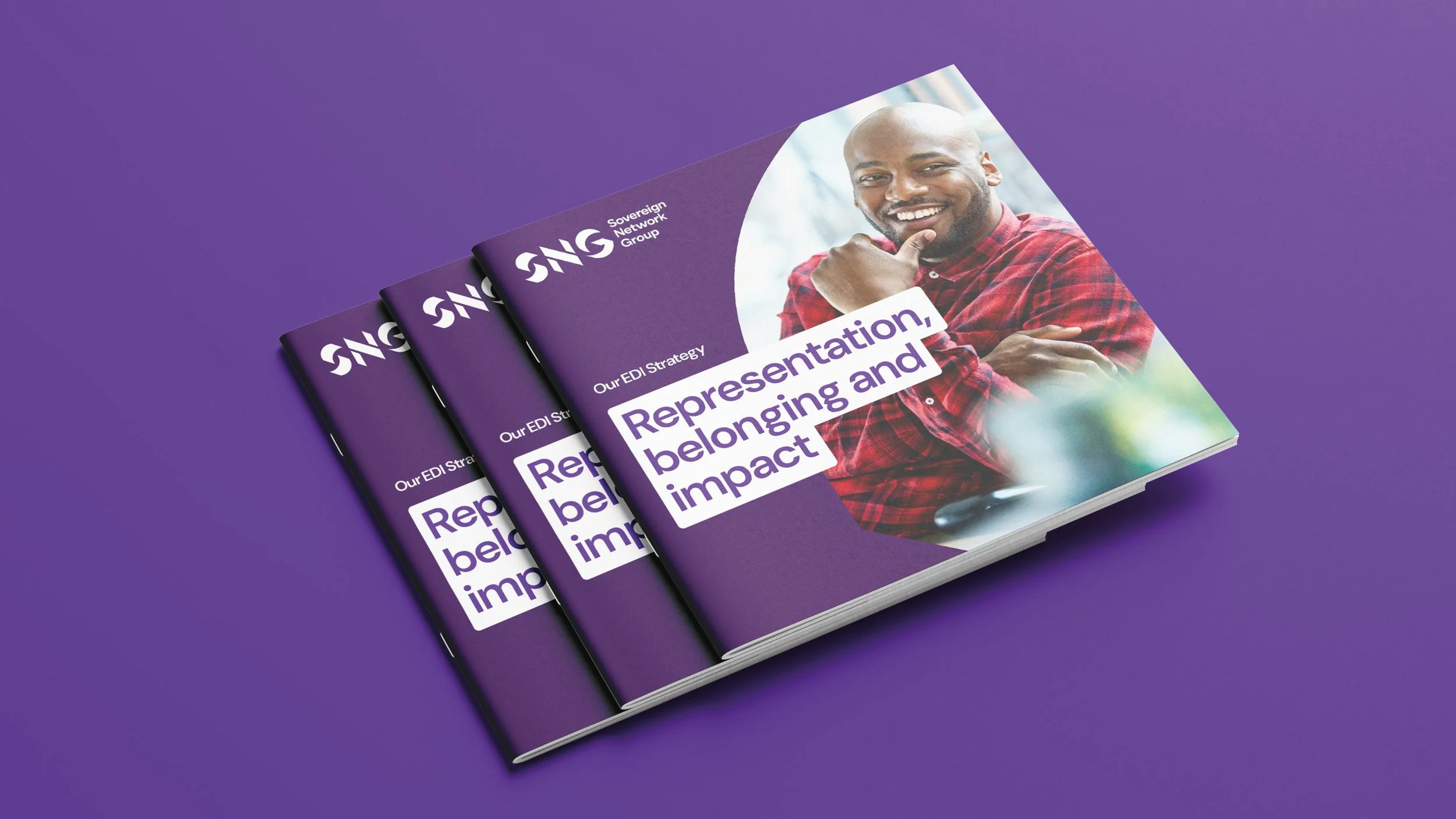
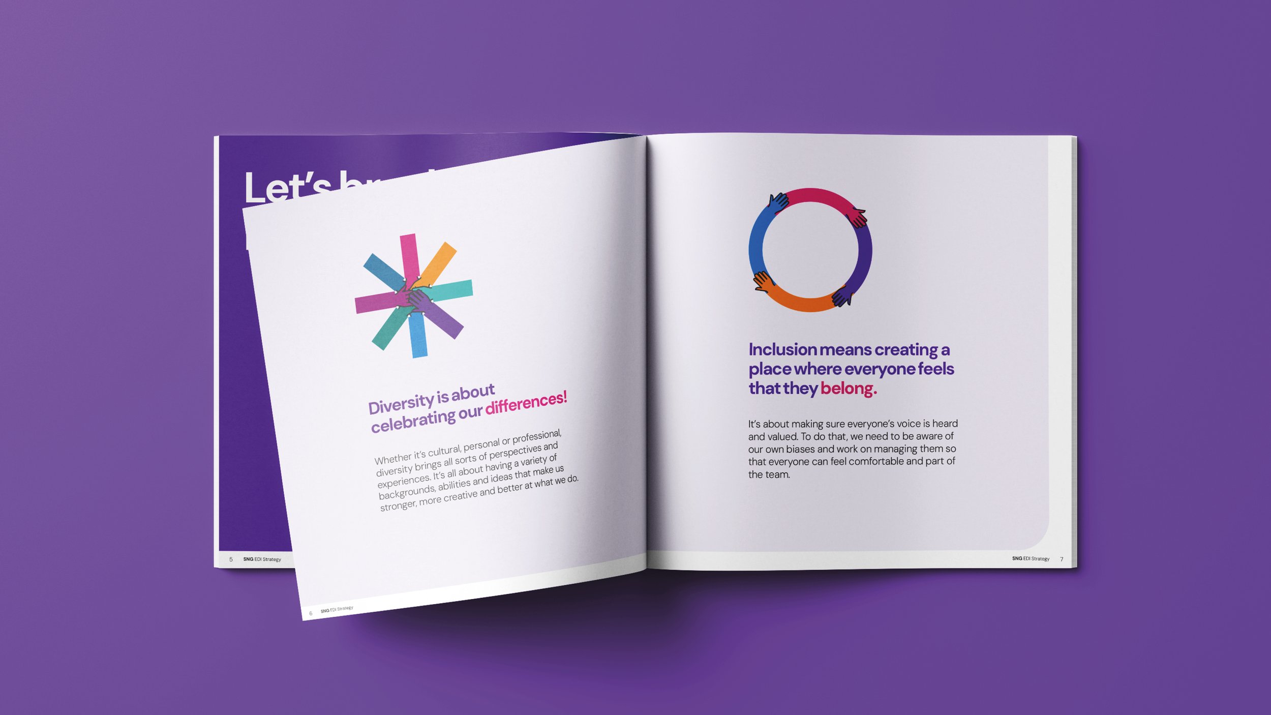
The creative concept ‘Reimagining housing’ signals the change in the organisation. The result is a brand that is brave, bold and modern and puts SNG in its rightful place as a trailblazing and trusted landlord and placemaker rethinking the way people live today and tomorrow.
The dynamic monochrome mark echoes SNG’s ambition to challenge convention.
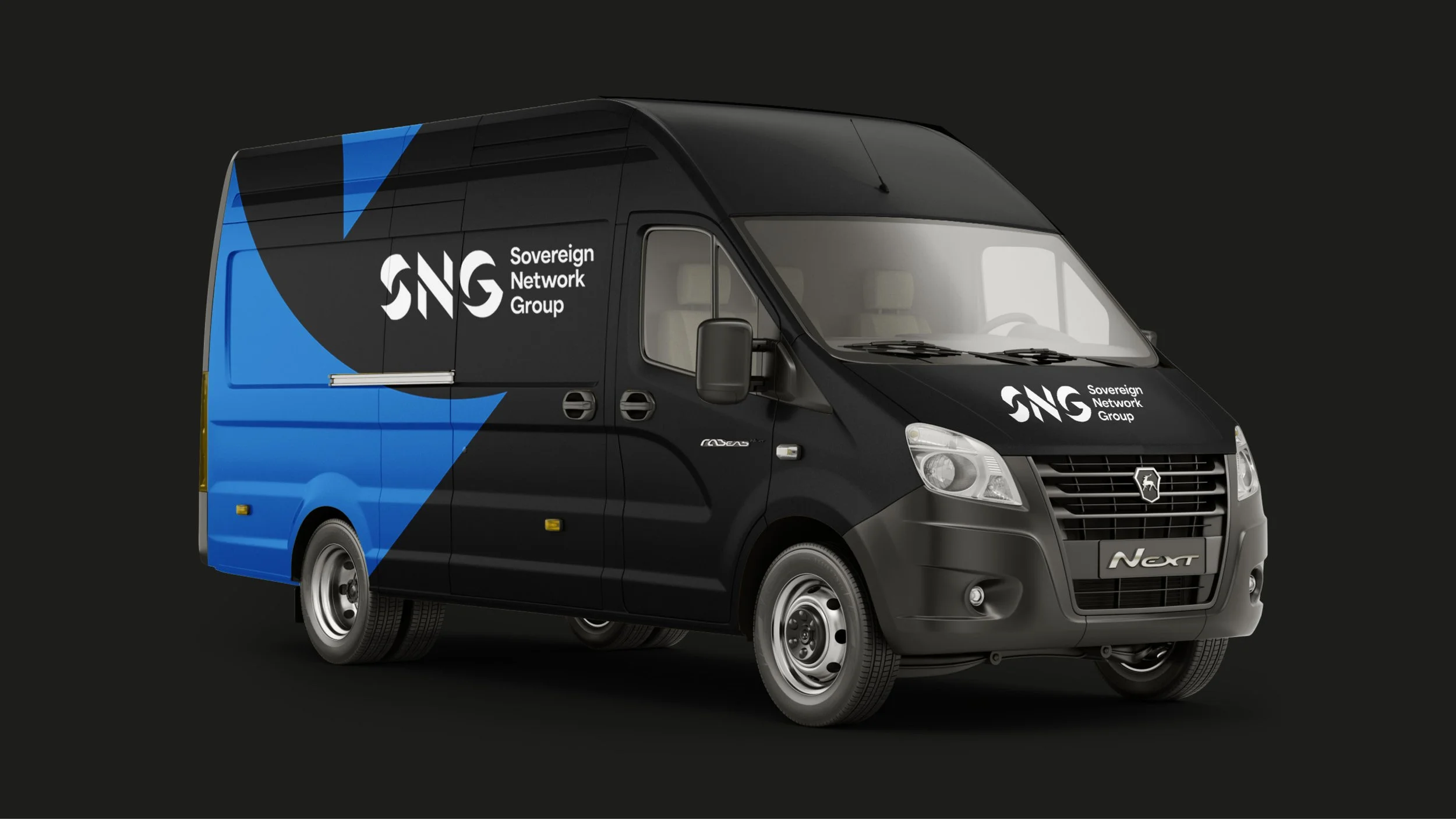
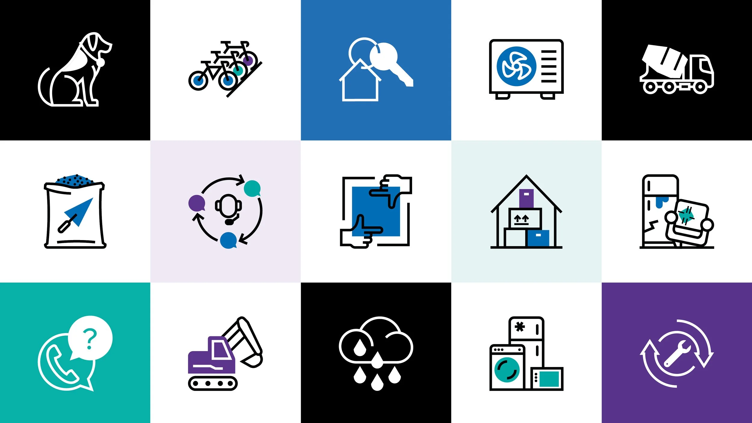
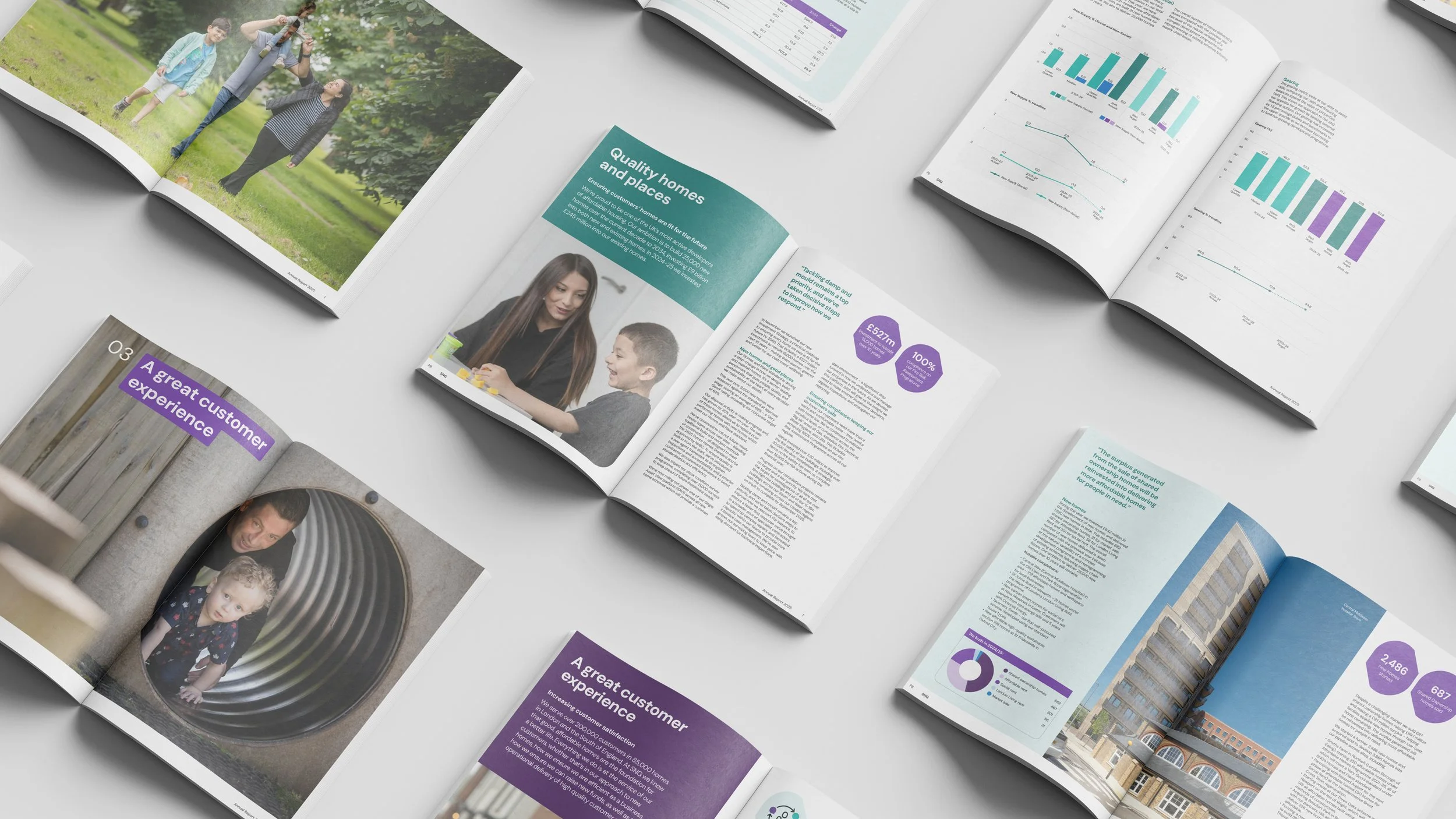
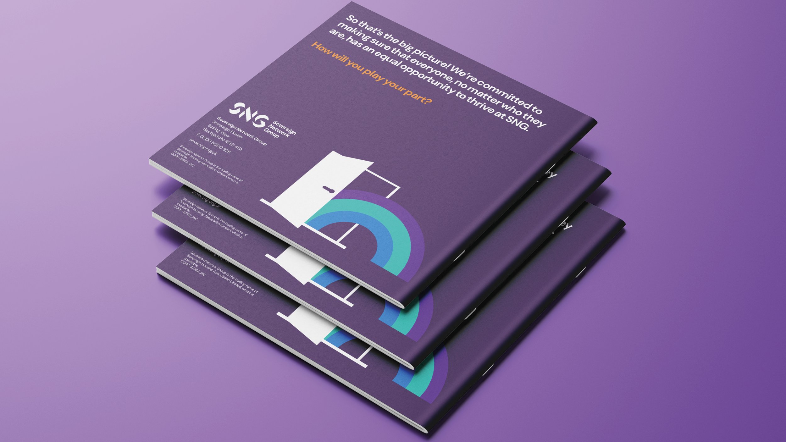
A flexible and dynamic toolkit was built to define the full brand experience – from van livery to digital platforms including website, apps, social media and animation.
© Created at Whirligig Creative